Project Report
Motivation
Recently, the COVID-19 pandemic has been a huge challenge for human beings. It was first identified in Wuhan, China in late December 2019, and then rapidly spread out worldwide. In order to contain the sudden COVID-19 outbreak, China implemented the lockdown policy in early February 2020, minimizing industrial, transportational, and commercial activities. Although the lockdown caused a tremendous economic loss, previous research had shown that the air condition in the top four megacities of China improved significantly during the lockdown period due to a dramatic decrease in automobile and industrial emissions (Wang et al., 2020). Bearing this in mind, we are motivated to find out whether “lockdown improves overall air quality” is a common phenomenon in Chinese cities including but not only limited to megacities. In addition, if there is indeed an association between lockdown and overall air quality, we are also interested in exploring the relationship between air quality improvement and other potentially correlated variables, for example, GDP, population, and temperature.
Introduction
The lockdown period started from early February to late April 2020. To ensure complete data coverage, we applied air quality data from February 1st to April 30th , 2020. Out of over 600 Chinese cities, we selected 30 representative ones based on geographical locations. For convenience, they are either municipalities or provincial capitals.
It has been established that seasonal variation does have a significant impact on air quality. Therefore, to control for the effects that different seasons have on air quality, we compared 30 cities’ air quality data during the lockdown period with the data during the same time period in 2019.
The air condition in a given area is usually denoted by the Air Quality Index (AQI), which is a variable describing the daily level of air pollution for five major pollutants. Each pollutant has its own AQI and for the purpose of this project, we will limit intended study objects to PM2.5, PM10, and NO2.
Questions
Is there a positive relationship between lockdown and air quality in the 30 cities that we are interested in? In other words, does lockdown improve the overall air quality level in each city?
Since the 30 cities are characterized by distinct locations, we are further interested in exploring whether location affects air quality improvement as well. If this statement holds, then which geographical area had the most significant improvement? Which one had the least?
The AQI is divided into 6 categories according to its value. Arranged in an ascending order, they are Good, Moderate, Unhealthy for Sensitive Groups, Unhealthy, Very Unhealthy, and Hazardous. Considering that the 30 cities are of different conditions, we want to investigate whether each city shares the same distribution of AQI categories or not.
Besides lockdown, are there any other potential variables that might be correlated with air quality improvement? We have come up with possible variables like GDP, population, and temperature and will conduct multiple linear regression to see if they are related.
Data
Data Source
The primary data source of this project is the Air Quality Historical Data Platform.
This public dataset collects daily air quality index (AQI) of various pollutants in each city from local weather bureau. All AQI values were calculated using the US EPA standard.
We can search for the name of our target city, and download a csv file containing daily AQI value for past seven years of six kinds of pollutants: PM2.5, PM10, O3, NO2, SO2 and CO. Data for all 100 cities were searched and downloaded manually by all group members.
The data of GDP and population in top 100 Chinese cities in GDP are collected online. We then create a cvs file containing city name, GDP in billion CNY, and population in thousand.
The daily average temperature data are from NOAA. We used below code chunk to extract weather data for each city:
weather_df =
  rnoaa::meteo_pull_monitors(
    c("CHM00054511", "CHM00058362", "CHM00050953", "CHM00054342", "CHM00055591", "CHM00056294", "CHM00056778", "CHM00059287", "CHM00057036", "CHM00057494"),
    var = c("PRCP", "TAVG"),
    date_min = "2020-02-01",
    date_max = "2020-04-30") %>%
  mutate(
    name = recode(
      id,
      CHM00054511 = "Beijing",
      CHM00058362 = "Shanghai",
      CHM00050953 = "Harbin",
      CHM00054342 = "Shenyang",
      CHM00055591 = "Lhasa",
      CHM00056294 = "Chengdu",
      CHM00056778 = "Kunming",
      CHM00059287 = "Guangzhou",
      CHM00057036 = "Xian",
      CHM00057494 = "Wuhan"),
    tavg = tavg / 10,
    prcp = prcp / 10) %>%
  select(-id) %>%
  rename(city = name) %>%
  relocate(city)
Data Description
AQI data
The downloaded AQI files of each city are in two directories: “30_cities_data” contains the 30 major cities that were used for bar graphs, box plots and line charts. The “100_cities_data” contains all 100 cities we downloaded, which were used for creating the interactive map, fitting the regression models and performing statistical tests. Each city’s AQI file is very straightforward. There are only seven variables:
date: The date of the following pollutant’s AQI recordings, in YYYY/MM/DD format
pm25: The AQI of tiny particles or droplets in the air that are two and one half microns or less in width
pm10: The AQI of tiny particles or droplets in the air that are 10 microns or less in width
o3: Ozone’s AQI
no2: nitrogen dioxide’s AQI
so2: sulfur dioxide’s AQI
co: carbon monoxide’s AQI
GDP and population data
The GDP and population dataset contains 4 variables:
rank: a city’s GDP ranking
city: city name
gdp_billion: GDP in billion CHY
population_thousand: population in thousand
Weather data
The resulting weather dataset contains 4 variables:
city: city name
date: the date that daily average temperature was collected
prcp: precipitation in mm
tavg: daily average temperature
Data Processing and Cleaning
The daily AQI data of each city was not ordered in time as expected. For example, January 2021 came before December 2021. We used as.Date() to covert all dates into R’s date format, and used the lubridate library and %within% to directly filter out the date period we are interested in.
After some exploratory graphing, We realized that not all pollutants from all time are recorded by each city’s local weather bureau, and we had to change our city selections. For example, we excluded the city “Hangzhou” from out original set of cities, since Hangzhou’s PM2.5 AQI data during the lockdown period was missing. We used another city close to Hangzhou to fill it’s position.
For graph representations, We choose 30 advanced-developed cities in china among the 100 cities. We wrote a function to loop through each city’s air quality data in the 30_cities_data directory, and did the same process for the 100_cities_data directory. We also create a data frame named: city_period_diff. It will hold each city’s mean daily AQI difference of each pollutant, between Feb~Aprl 2019 and Feb~Aprl 2020. We used interval() to create time intervals that will be used to extract air quality data from out interested time period: “2018-02-01” ~ “2018-04-30”, “2019-02-01” ~ “2019-04-30”, “2020-02-01” ~ “2020-04-30”, and “2021-02-01” ~ “2021-04-30”.
city_files = list.files("30_cities_data")
onehundrd_city_files = list.files("100_cities_data")


city_period_diff =
  tibble(city = character(),
         pm25 = numeric(),
         pm10 = numeric(),
         o3 = numeric(),
         no2 = numeric(),
         so2 = numeric(),
         co = numeric(),
         )

period_18 = interval(ymd("2018-02-01"), ymd("2018-04-30"))
period_19 = interval(ymd("2019-02-01"), ymd("2019-04-30"))
period_20 = interval(ymd("2020-02-01"), ymd("2020-04-30"))
period_21 = interval(ymd("2021-02-01"), ymd("2021-04-30"))
Compute the daily mean pollutant AQI from Feb to Apr of year 2019 and year 2020 in each city.
for (city_file in city_files) {
  #print(city_file)

  path = str_c("30_cities_data/", city_file)
  city = strsplit(city_file, split = '-')[[1]][1]

  cityAir = read_csv(path) %>%
    mutate(date = as.Date(date, "%Y/%m/%d")) %>%
    arrange(date)

  cityAir_19 = cityAir %>%
    filter(date %within% period_19)

  cityAir_20 = cityAir %>%
    filter(date %within% period_20)


  pm25_19 = mean(cityAir_19$pm25, na.rm = T)
  pm25_20 = mean(cityAir_20$pm25, na.rm = T)
  pm25d = pm25_20 - pm25_19

  pm10_19 = mean(cityAir_19$pm10, na.rm = T)
  pm10_20 = mean(cityAir_20$pm10, na.rm = T)
  pm10d = pm10_20 - pm10_19

  o3_19 = mean(cityAir_19$o3, na.rm = T)
  o3_20 = mean(cityAir_20$o3, na.rm = T)
  o3d = o3_20 - o3_19

  no2_19 = mean(cityAir_19$no2, na.rm = T)
  no2_20 = mean(cityAir_20$no2, na.rm = T)
  no2d = no2_20 - no2_19

  so2_19 = mean(cityAir_19$so2, na.rm = T)
  so2_20 = mean(cityAir_20$so2, na.rm = T)
  so2d = so2_20 - so2_19

  co_19 = mean(cityAir_19$co, na.rm = T)
  co_20 = mean(cityAir_20$co, na.rm = T)
  cod = co_20 - co_19

  city_period_diff =
    city_period_diff %>%
    add_row(city = city,
            pm25 = pm25d,
            pm10 = pm10d,
            o3 = o3d,
            no2 = no2d,
            so2 = so2d,
            co = cod)
}
Then, we transfer the “city” in city_period_diff from the character to factor and make a decreasing sequence by using reorder based on the pm2.5.
city_period_diff =
  city_period_diff %>%
  mutate(
    city = paste(
      toupper(substring(city, 1, 1)),
      substring(city, 2),
      sep = ""),
    city = fct_reorder(city, pm25, .desc = T),
    )
Now we will see how the distribution of daily PM25 AQI differ between time period 2019 Feb-Apr and 2020 Feb~Apr.
city_AQI_Distribution = tibble()

for (city_file in city_files) {

  path = str_c("30_cities_data/", city_file)
  city = strsplit(city_file, split = '-')[[1]][1]

  cityAir = read_csv(path) %>%
    mutate(date = as.Date(date, "%Y/%m/%d")) %>%
    arrange(date)

  city_19 = cityAir %>%
    filter(date %within% period_19) %>%
    mutate(period = "2019Feb-Apr",
           day = format(date,"%m-%d"),
           city = city) %>%
    relocate(city, period, day)

  #add a fake date "2019-02-29" with all AQI values as NA
  city_19 =
    city_19 %>%
    add_row(city = city,
            period = "2019Feb-Apr",
            day = "02-29") %>%
    mutate(day = as.factor(day))


  city_20 = cityAir %>%
    filter(date %within% period_20) %>%
    mutate(period = "2020Feb-Apr",
           day = format(date,"%m-%d"),
           day = as.factor(day),
           city = city) %>%
    relocate(city, period, day)

  city_AQI_Distribution = rbind(city_AQI_Distribution, city_19)
  city_AQI_Distribution = rbind(city_AQI_Distribution, city_20)
}
city_AQI_Distribution =
city_AQI_Distribution %>%
mutate(period = factor(period, levels = c("2020Feb-Apr", "2019Feb-Apr")),
city = paste(
toupper(substring(city, 1, 1)),
substring(city, 2),
sep = ""))In order to see the previous data, we focus on past three years. so we tidy the past Four Years’ Feb~Apr Mean PM2.5 AQI.The steps are the same as the previous one.
for (city_file in city_files) {
  #print(city_file)

  path = str_c("30_cities_data/", city_file)
  city = strsplit(city_file, split = '-')[[1]][1]

  cityAir = read_csv(path) %>%
    mutate(date = as.Date(date, "%Y/%m/%d")) %>%
    arrange(date)

  cityAir_18 = cityAir %>%
    filter(date %within% period_18)

  cityAir_19 = cityAir %>%
    filter(date %within% period_19)

  cityAir_20 = cityAir %>%
    filter(date %within% period_20)

  cityAir_21 = cityAir %>%
    filter(date %within% period_21)

  mean_18 = mean(cityAir_18$pm25, na.rm = T)
  mean_19 = mean(cityAir_19$pm25, na.rm = T)
  mean_20 = mean(cityAir_20$pm25, na.rm = T)
  mean_21 = mean(cityAir_21$pm25, na.rm = T)

  city_4year_meanPM25 =
    city_4year_meanPM25 %>%
    add_row(city = city,
            mean_18 = mean_18,
            mean_19 = mean_19,
            mean_20 = mean_20,
            mean_21 = mean_21)
}
city_4year_meanPM25 =
city_4year_meanPM25 %>%
mutate(city = factor(city)) %>%
pivot_longer(
mean_18:mean_21,
values_to = "mean",
names_to = "years"
)Besides PM2.5, we also want to know how NO2 mean API mean change for four years from Feb to Apr. The steps for tidying and clearning data for NO2 are similar.
city_4year_meanno2 =
  tibble(city = character(),
         mean_18 = numeric(),
         mean_19 = numeric(),
         mean_20 = numeric(),
         mean_21 = numeric())
for (city_file in city_files) {
#print(city_file)
path = str_c("30_cities_data/", city_file)
city = strsplit(city_file, split = '-')[[1]][1]
cityAir = read_csv(path) %>%
mutate(date = as.Date(date, "%Y/%m/%d")) %>%
arrange(date)
cityAir_18 = cityAir %>%
filter(date %within% period_18)
cityAir_19 = cityAir %>%
filter(date %within% period_19)
cityAir_20 = cityAir %>%
filter(date %within% period_20)
cityAir_21 = cityAir %>%
filter(date %within% period_21)
mean_18 = mean(cityAir_18$no2, na.rm = T)
mean_19 = mean(cityAir_19$no2, na.rm = T)
mean_20 = mean(cityAir_20$no2, na.rm = T)
mean_21 = mean(cityAir_21$no2, na.rm = T)
city_4year_meanno2 =
city_4year_meanno2 %>%
add_row(city = city,
mean_18 = mean_18,
mean_19 = mean_19,
mean_20 = mean_20,
mean_21 = mean_21)
}city_4year_meanno2 =
city_4year_meanno2 %>%
mutate(city = factor(city)) %>%
pivot_longer(
mean_18:mean_21,
values_to = "mean",
names_to = "years"
)In terms of the dataset of GDP and population for regression analysis, we calculate mean PM2.5 AQI (Feb-Apr) in 2019 and 2020 and mean PM2.5 AQI difference (2019 minus 2020) for each top 100 city in GDP. We then use left_join function to join the GDP and population dataset to the mean PM2.5 AQI difference dataset to get the resulting dataset for regression analysis.
library(tidyverse)
library(ggridges)

theme_set(theme_minimal() + theme(legend.position = "bottom"))

options(
  ggplot2.continuous.colour = "viridis",
  ggplot2.continuous.fill = "viridis"
)

scale_colour_discrete = scale_colour_viridis_d
scale_fill_discrete = scale_fill_viridis_d

city_100_df =
  tibble(
  file = list.files("100_cities_data")) %>%
  mutate(
    city = str_remove(file, "-air-quality.csv"),
    path = str_c("100_cities_data/", file),
    data = map(path, read_csv)
  ) %>%
  unnest(data) %>%
  select(-file, -path) %>%
  mutate(
    city = str_to_title(city),
    date = as.Date(date, format = "%Y/%m/%d"))

pm25_2020 =
  city_100_df %>%
  filter(date > "2020-01-31" & date < "2020-05-01") %>%
  group_by(city) %>%
  summarize(mean_pm25_2020 = mean(pm25, na.rm = T))

pm25_2019 =
  city_100_df %>%
  filter(date > "2019-01-31" & date < "2019-05-01") %>%
  group_by(city) %>%
  summarize(mean_pm25_2019 = mean(pm25, na.rm = T))

pm25_diff =
  left_join(pm25_2020, pm25_2019) %>%
  mutate(pm25_diff = mean_pm25_2019 - mean_pm25_2020)

gdp_pop_df =
  read_csv("data/gpd_and_popluation.csv") %>%
  janitor::clean_names() %>%
  mutate(
    gdp_trillion = gdp_billion / 1000,
    pop_million = population_thousand / 1000) %>%
  select(city, gdp_trillion, pop_million)

diff_gdp_pop_df =
  left_join(pm25_diff, gdp_pop_df) %>%
  select(-mean_pm25_2020, -mean_pm25_2019)
For regression of daily PM2.5 vs daily average temperature, we filter PM2.5 AQI from February through April in only 2020 , and collect daily average temperature data during this time period from NOAA. We then join them using left_join function.
weather_df =
  rnoaa::meteo_pull_monitors(
    c("CHM00054511", "CHM00058362", "CHM00050953", "CHM00054342", "CHM00055591", "CHM00056294", "CHM00056778", "CHM00059287", "CHM00057036", "CHM00057494"),
    var = c("PRCP", "TAVG"),
    date_min = "2020-02-01",
    date_max = "2020-04-30") %>%
  mutate(
    name = recode(
      id,
      CHM00054511 = "Beijing",
      CHM00058362 = "Shanghai",
      CHM00050953 = "Harbin",
      CHM00054342 = "Shenyang",
      CHM00055591 = "Lhasa",
      CHM00056294 = "Chengdu",
      CHM00056778 = "Kunming",
      CHM00059287 = "Guangzhou",
      CHM00057036 = "Xian",
      CHM00057494 = "Wuhan"),
    tavg = tavg / 10,
    prcp = prcp / 10) %>%
  select(-id) %>%
  rename(city = name) %>%
  relocate(city)

city_10_df =
  city_100_df %>%
  filter(date > "2020-01-31" & date < "2020-05-01") %>%
  filter(city %in% c("Beijing", "Shanghai", "Harbin", "Shenyang", "Lhasa", "Chengdu", "Kunming", "Guangzhou", "Xian", "Wuhan"))

pm25_tavg_df =
  left_join(city_10_df, weather_df, by = c("city", "date")) %>%
  arrange(date) %>%
  select(city, date, pm25, tavg) %>%
  filter(pm25 != "NA")
Exploratory Analysis
Time period
We are majorly interested in the time period “2019-02-01” ~ “2019-04-30” and “2020-02-01” ~ “2020-04-30”, where the second period is when China entered mass lockdown to control the spread of COVID-19. We used multiple strategies to visualize how the air quality index of different pollutants during the lockdown changed comparing to the same period in 2019, in major Chinese cities.
Besides the above time periods, we also extracted air quality data of each city from 2018 and 2021 to get a more comprehensive view of change in air quality in Chinese cities.
period_18 = interval(ymd("2018-02-01"), ymd("2018-04-30"))
period_19 = interval(ymd("2019-02-01"), ymd("2019-04-30"))
period_20 = interval(ymd("2020-02-01"), ymd("2020-04-30"))
period_21 = interval(ymd("2021-02-01"), ymd("2021-04-30"))
Air quality data
city_period_diff will hold each city’s mean daily AQI difference of each pollutant, between 2019 Feb~Apr and 2020 Feb~Apr.
city_files = list.files("30_cities_data")
onehundrd_city_files = list.files("100_cities_data")

city_period_diff =
  tibble(city = character(),
         pm25 = numeric(),
         pm10 = numeric(),
         o3 = numeric(),
         no2 = numeric(),
         so2 = numeric(),
         co = numeric(),
         )
Daily Mean AQI difference Analysis
Compute the daily mean pollutant AQI from Feb to Apr of year 2019 and year 2020 in each city.
for (city_file in city_files) {
  #print(city_file)

  path = str_c("30_cities_data/", city_file)
  city = strsplit(city_file, split = '-')[[1]][1]

  cityAir = read_csv(path) %>%
    mutate(date = as.Date(date, "%Y/%m/%d")) %>%
    arrange(date)

  cityAir_19 = cityAir %>%
    filter(date %within% period_19)

  cityAir_20 = cityAir %>%
    filter(date %within% period_20)


  pm25_19 = mean(cityAir_19$pm25, na.rm = T)
  pm25_20 = mean(cityAir_20$pm25, na.rm = T)
  pm25d = pm25_20 - pm25_19

  pm10_19 = mean(cityAir_19$pm10, na.rm = T)
  pm10_20 = mean(cityAir_20$pm10, na.rm = T)
  pm10d = pm10_20 - pm10_19

  o3_19 = mean(cityAir_19$o3, na.rm = T)
  o3_20 = mean(cityAir_20$o3, na.rm = T)
  o3d = o3_20 - o3_19

  no2_19 = mean(cityAir_19$no2, na.rm = T)
  no2_20 = mean(cityAir_20$no2, na.rm = T)
  no2d = no2_20 - no2_19

  so2_19 = mean(cityAir_19$so2, na.rm = T)
  so2_20 = mean(cityAir_20$so2, na.rm = T)
  so2d = so2_20 - so2_19

  co_19 = mean(cityAir_19$co, na.rm = T)
  co_20 = mean(cityAir_20$co, na.rm = T)
  cod = co_20 - co_19

  city_period_diff =
    city_period_diff %>%
    add_row(city = city,
            pm25 = pm25d,
            pm10 = pm10d,
            o3 = o3d,
            no2 = no2d,
            so2 = so2d,
            co = cod)
}
city_period_diff =
city_period_diff %>%
mutate(
city = paste(
toupper(substring(city, 1, 1)),
substring(city, 2),
sep = ""),
city = fct_reorder(city, pm25, .desc = T),
)Interative bar graph of AQI Difference
city_period_diff %>%
  plot_ly(x = ~pm25, y = ~city, type = "bar", opacity = 1) %>%
  layout(title = "Feb~Apr Daily Mean PM25 AQI Difference, 2020 minus 2019",
         barmode = 'overlay',
         xaxis = list(title = "Mean AQI Difference"),
         yaxis = list(autotick = F, title = "Cities"),
         updatemenus = list(
           list(
            y = 1.1,
            buttons = list(
              list(method = "update",
                   args = list(list(x = list(~pm25)),
                               list(title = "Feb~Apr Daily Mean PM25 AQI Difference, 2020 minus 2019")
                               ),
                   label = "pm25"),
              list(method = "update",
                   args = list(list(x = list(~pm10)),
                               list(title = "Feb~Apr Daily Mean PM10 AQI Difference, 2020 minus 2019")
                               ),
                   label = "pm10"),
              list(method = "update",
                   args = list(list(x = list(~o3)),
                               list(title = "Feb~Apr Daily Mean O3 AQI Difference, 2020 minus 2019")
                               ),
                   label = "o3"),
              list(method = "update",
                   args = list(list(x = list(~no2)),
                               list(title = "Feb~Apr Daily Mean NO2 AQI Difference, 2020 minus 2019")
                               ),
                   label = "no2"),
              list(method = "update",
                   args = list(list(x = list(~so2)),
                               list(title = "Feb~Apr Daily Mean SO2 AQI Difference, 2020 minus 2019")
                               ),
                   label = "so2"),
              list(method = "update",
                   args = list(list(x = list(~co)),
                               list(title = "Feb~Apr Daily Mean CO AQI Difference, 2020 minus 2019")
                               ),
                   label = "co")
            )
  )))
This interactive plot shows each pollutant’s Daily AQI difference, the value from 2020 Feb-Apr minus the value from 2019 Feb~Apr, in each city. A negative AQI change here indicates improvements in air quality. The users can click on the dropdown selection button on the top left to choose the pollutant type: PM2.5, PM10, O3, NO2, SO2 and CO. For PM2.5,PM10, CO and NO2. The mean AQI for most cities droped during the lockdown, showing general improvements in air quality. While for SO2 and O3, there are more cities with increased AQI during lockdown, with the O3 level increased for most of the cities in China.
Distribution Analysis
Now we will see how the distribution of daily PM25 AQI differ between time period 2019 Feb-Apr and 2020 Feb~Apr.
city_AQI_Distribution = tibble()

for (city_file in city_files) {

  path = str_c("30_cities_data/", city_file)
  city = strsplit(city_file, split = '-')[[1]][1]

  cityAir = read_csv(path) %>%
    mutate(date = as.Date(date, "%Y/%m/%d")) %>%
    arrange(date)

  city_19 = cityAir %>%
    filter(date %within% period_19) %>%
    mutate(period = "2019Feb-Apr",
           day = format(date,"%m-%d"),
           city = city) %>%
    relocate(city, period, day)

  #add a fake date "2019-02-29" with all AQI values as NA
  city_19 =
    city_19 %>%
    add_row(city = city,
            period = "2019Feb-Apr",
            day = "02-29") %>%
    mutate(day = as.factor(day))


  city_20 = cityAir %>%
    filter(date %within% period_20) %>%
    mutate(period = "2020Feb-Apr",
           day = format(date,"%m-%d"),
           day = as.factor(day),
           city = city) %>%
    relocate(city, period, day)

  city_AQI_Distribution = rbind(city_AQI_Distribution, city_19)
  city_AQI_Distribution = rbind(city_AQI_Distribution, city_20)
}
city_AQI_Distribution =
city_AQI_Distribution %>%
mutate(period = factor(period, levels = c("2020Feb-Apr", "2019Feb-Apr")),
city = paste(
toupper(substring(city, 1, 1)),
substring(city, 2),
sep = ""))Interactive Side-by-side Boxplots
#This way is stupid but it works! I tried other methods but they just don't work as expected!!!
city_AQI_Distribution %>%
  plot_ly(
    y = ~city, x = ~pm25, color = ~period, type = "box",
    colors = c(rgb(0.2, 0.6, 0.8, 0.6), rgb(0.8, 0.2, 0.2, 0.6))) %>%
  add_trace(
    x = ~pm10, visible = F) %>%
  add_trace(
    x = ~o3, visible = F) %>%
  add_trace(
    x = ~no2, visible = F) %>%
  add_trace(
    x = ~so2, visible = F) %>%
  add_trace(
    x = ~co, visible = F) %>%

  layout(title = "Daily PM25 AQI Distribution, 2019 and 2020 Feb-Apr",
         xaxis = list(title = "Daily AQI"),
         yaxis = list(autotick = F, title = "Cities"),
         boxmode = "group",
         updatemenus = list(
            list(
              y = 1.1,
              buttons = list(
                list(label = "PM25",
                     method = "update",
                     args = list(list(visible = c(T,T, F,F, F,F, F,F, F,F, F,F)),
                                 list(title = "Daily PM25 AQI Distribution, 2019 and 2020 Feb-Apr"))),
                list(label = "PM10",
                     method = "update",
                     args = list(list(visible = c(F,F, T,T, F,F, F,F, F,F, F,F)),
                                 list(title = "Daily PM10 AQI Distribution, 2019 and 2020 Feb-Apr"))),
                list(label = "O3",
                     method = "update",
                     args = list(list(visible = c(F,F, F,F, T,T, F,F, F,F, F,F)),
                                 list(title = "Daily O3 AQI Distribution, 2019 and 2020 Feb-Apr"))),
                list(label = "no2",
                     method = "update",
                     args = list(list(visible = c(F,F, F,F, F,F, T,T, F,F, F,F)),
                                 list(title = "Daily NO2 AQI Distribution, 2019 and 2020 Feb-Apr"))),
                list(label = "so2",
                     method = "update",
                     args = list(list(visible = c(F,F, F,F, F,F, F,F, T,T, F,F)),
                                 list(title = "Daily SO2 AQI Distribution, 2019 and 2020 Feb-Apr"))),
                list(label = "co",
                     method = "update",
                     args = list(list(visible = c(F,F, F,F, F,F, F,F, F,F, T,T)),
                                 list(title = "Daily CO AQI Distribution, 2019 and 2020 Feb-Apr")))
                ))
            ))
This interactive boxplot shows each pollutant’s Daily AQI Distribution, 2019 and 2020 Feb-Apr, in each city. The users can click on the dropdown selection button on the top left to choose the pollutant type: PM2.5, PM10, O3, NO2, SO2 and CO. Each city has two boxes. The blue one represents the 2020 Feb-Apr period, and the red one represents the 2021 Feb-Apr period. Besides, the median, min, max, q1, q3 and outliers are showed in the box plot for each city. This plot indicates that the distributions of daily pollutant AQI in 2020 (blue) are generally lower than those in 2019 (red).
Line charts of daily pm2.5 AQI for 30 major cities.
(Note that year 2019 does not have the date “Feb 29”, but year 2020 does.)
city_AQI_Distribution %>%
  ggplot(aes(x = day, y = pm25, color = period)) +
  geom_line(aes(group = period), size = 0.8) +
  #geom_point() +
  scale_color_hue(direction = -1) +
  ylim(0, 400) +
  labs(
    title = "Daily PM25 AQI Starting From Feb 1 to Apr 30",
    x = "Day",
    y = "Daily PM25 AQI",
    color = "year period") +
  facet_wrap(~city, nrow = 10) +
  scale_x_discrete(breaks = c("02-01", "02-11", "02-21",
                              "03-01", "03-11", "03-21",
                              "04-01", "04-11", "04-21")) +
  theme(axis.text.x = element_text(angle = 45, hjust = 1))
These line charts show daily PM2.5 AQI starting from Feb1 to Apr 30. For each city, the blue line represents data from 2020, and red line represents data from 2019. Note that year 2019 does not have the date “Feb 29”, but year 2020 does. Thus in the graphs, the red lines of year 2019 does not have data for Feb 29, but the blue lines of year 2020 do.
We can see that although there are fluctuations, generally daily PM2.5 AQI during the lockdown is lower than the same period in year 2019, for each city.
Line charts of daily NO2 AQI changes for all 30 cities.
city_AQI_Distribution %>%
  ggplot(aes(x = day, y = no2, color = period)) +
  geom_line(aes(group = period), size = 0.8) +
  #geom_point() +
  scale_color_hue(direction = -1) +
  ylim(0, 60) +
  labs(
    title = "Daily NO2 AQI Starting From Feb 1 to Apr 30",
    x = "Day",
    y = "Daily NO2 AQI",
    color = "year period") +
  facet_wrap(~city, nrow = 10) +
  scale_x_discrete(breaks = c("02-01", "02-11", "02-21",
                              "03-01", "03-11", "03-21",
                              "04-01", "04-11", "04-21")) +
  theme(axis.text.x = element_text(angle = 45, hjust = 1))
These line charts show daily NO2 AQI starting from Feb 1 to Apr 30. Similar to PM2.5 AQI trends, daily NO2 AQI during the lockdown is generally lower than the same period in year 2019, for each city.
Past Four Years’ Feb~Apr Mean PM2.5 AQI
A bar graph of mean PM2.5 AQI from Feb to Apr in the past four years in 30 representative cities.
for (city_file in city_files) {
  #print(city_file)

  path = str_c("30_cities_data/", city_file)
  city = strsplit(city_file, split = '-')[[1]][1]

  cityAir = read_csv(path) %>%
    mutate(date = as.Date(date, "%Y/%m/%d")) %>%
    arrange(date)

  cityAir_18 = cityAir %>%
    filter(date %within% period_18)

  cityAir_19 = cityAir %>%
    filter(date %within% period_19)

  cityAir_20 = cityAir %>%
    filter(date %within% period_20)

  cityAir_21 = cityAir %>%
    filter(date %within% period_21)

  mean_18 = mean(cityAir_18$pm25, na.rm = T)
  mean_19 = mean(cityAir_19$pm25, na.rm = T)
  mean_20 = mean(cityAir_20$pm25, na.rm = T)
  mean_21 = mean(cityAir_21$pm25, na.rm = T)

  city_4year_meanPM25 =
    city_4year_meanPM25 %>%
    add_row(city = city,
            mean_18 = mean_18,
            mean_19 = mean_19,
            mean_20 = mean_20,
            mean_21 = mean_21)
}
city_4year_meanPM25 =
city_4year_meanPM25 %>%
mutate(city = factor(city)) %>%
pivot_longer(
mean_18:mean_21,
values_to = "mean",
names_to = "years"
)city_4year_meanPM25 %>%
ggplot() +
geom_bar(
aes(y = years, x = mean, fill = years),
stat = "identity") +
facet_wrap(~city, nrow = 5) +
#scale_x_continuous(breaks = scales::pretty_breaks(n = 20)) +
theme(legend.position = "none") +
labs(
title = "A bar graph of mean PM2.5 AQI from Feb to Apr in the past four years",
x = "PM25 AQI Mean",
y = "City")
This bar graph shows mean PM2.5 AQI from Feb to Apr in the past four years for 30 cities. (note Xining does not have mean of 2021.) We can see the trend that mean PM2.5 AQI decreased from 2018 to 2020 but bounced back in 2021 for most of 30 cities. The mean PM2.5 AQI in 2020 is the lowest one compared with other 3 years. This is highly likely to be due to the lockdown policy in 2020. The mean PM2.5 AQI in 2021 gets back up because of the economy recovery.
Past Four Years’ Feb~Apr Mean NO2 AQI
A bar graph of mean NO2 AQI from Feb to Apr in the past four years in 30 representative cities.
city_4year_meanno2 =
  tibble(city = character(),
         mean_18 = numeric(),
         mean_19 = numeric(),
         mean_20 = numeric(),
         mean_21 = numeric())
for (city_file in city_files) {
#print(city_file)
path = str_c("30_cities_data/", city_file)
city = strsplit(city_file, split = '-')[[1]][1]
cityAir = read_csv(path) %>%
mutate(date = as.Date(date, "%Y/%m/%d")) %>%
arrange(date)
cityAir_18 = cityAir %>%
filter(date %within% period_18)
cityAir_19 = cityAir %>%
filter(date %within% period_19)
cityAir_20 = cityAir %>%
filter(date %within% period_20)
cityAir_21 = cityAir %>%
filter(date %within% period_21)
mean_18 = mean(cityAir_18$no2, na.rm = T)
mean_19 = mean(cityAir_19$no2, na.rm = T)
mean_20 = mean(cityAir_20$no2, na.rm = T)
mean_21 = mean(cityAir_21$no2, na.rm = T)
city_4year_meanno2 =
city_4year_meanno2 %>%
add_row(city = city,
mean_18 = mean_18,
mean_19 = mean_19,
mean_20 = mean_20,
mean_21 = mean_21)
}city_4year_meanno2 =
city_4year_meanno2 %>%
mutate(city = factor(city)) %>%
pivot_longer(
mean_18:mean_21,
values_to = "mean",
names_to = "years"
)city_4year_meanno2 %>%
ggplot() +
geom_bar(
aes(y = years, x = mean, fill = years),
stat = "identity") +
facet_wrap(~city, nrow = 5) +
#scale_x_continuous(breaks = scales::pretty_breaks(n = 20)) +
theme(legend.position = "none") +
labs(
title = "A bar graph of mean NO2 AQI from Feb to Apr in the past four years",
x = "NO2 AQI Mean",
y = "City")
This bar graph shows mean NO2 AQI from Feb to Apr in the past four years for 30 cities. (note Xining does not have mean of 2021.) Mean NO2 AQI has similar trends to mean PM2.5 AQI. And the reason for this trend is the same as PM2.5 AQI.
Hypothesis Test and Analysis
Chi-Squared Test
knitr::opts_chunk$set(echo = TRUE)

library(magrittr)
library(dplyr)
library(pivottabler)
library(tidyverse)
library(ggridges)
library(modelr)
library(mgcv)

theme_set(theme_minimal() + theme(legend.position = "bottom"))
options(
  ggplot2.continuous.colour = "viridis",
  ggplot2.continuous.fill = "viridis"
)
scale_colour_discrete = scale_colour_viridis_d
scale_fill_discrete = scale_fill_viridis_d

city_30_df_pm25 = tibble(
  file = list.files("30_cities_data")) %>%
  mutate(
    city = str_remove(file, "-air-quality.csv"),
    path = str_c("30_cities_data/", file),
    data = map(path, read_csv)
  ) %>%
  unnest(data) %>%
  select(-file, -path) %>%
  mutate(
    city = str_to_title(city),
    date = as.Date(date, format = "%Y/%m/%d")) %>%
  select(city,date,pm25)

pm25_2020 =
  city_30_df_pm25 %>%
  filter(date > "2020-01-31" & date < "2020-05-01") %>%
  mutate(date = format(date, format = "%y-%m-%d")) %>%
  select(city, date, pm25)


pm25_2019 =
  city_30_df_pm25 %>%
  filter(date > "2019-01-31" & date < "2019-05-01") %>%
  mutate(date = format(date, format = "%y-%m-%d")) %>%
  select(city, date, pm25)

pm25_2018 =
  city_30_df_pm25 %>%
  filter(date > "2018-01-31" & date < "2018-05-01") %>%
  mutate(date = format(date, format = "%y-%m-%d")) %>%
  select(city, date, pm25)

pm25_2017 =
  city_30_df_pm25 %>%
  filter(date > "2017-01-31" & date < "2017-05-01") %>%
  mutate(date = format(date, format = "%y-%m-%d")) %>%
  select(city, date, pm25)

pm25_171819 = rbind(pm25_2017,pm25_2018,pm25_2019)

pm25_1920 = rbind(pm25_2020,pm25_2019)
Are cities and air quality level dependent at 5% level of significance? In other words, given the data collected above, is there a relationship between the cities and the level of air quality that they have obtained?
Null hypothesis (H0): the air quality level and the different cities variables of the contingency table are independent in 2020 between February to April.
Alternative hypothesis (H1): the air quality level and the different cities variables of the contingency table are dependent in 2020 between February to April.
city_PM25 = pm25_2020 %>%
  drop_na() %>%
  select(city,pm25) %>%
  mutate(level = as.character(pm25)) %>%
  mutate(
    level = case_when(
      pm25 <= 50 ~ 'Good',
      pm25 <= 100 ~ 'Moderate',
      pm25 <= 150 ~ 'Unhealthy for Sensitive People',
      pm25 <= 200 ~ ' Unhealthy',
      pm25 <= 300 ~ 'Very Unhealthy',
      pm25 <= 500 ~ 'Hazardous')) %>%
  arrange(city,level,pm25)

city_level =
  city_PM25 %>%
  group_by(city,level) %>%
  summarise(n = n()) %>%
  pivot_wider(names_from = "level", values_from = "n")

city_level[is.na(city_level)] = 0
Air Quality Level Table
airquality_level = read.csv("test (Fei)/city_air_quality_level.csv", row.names = 1 )
knitr::kable(airquality_level)| Good | Moderate | Unhealthy.for.Sensitive.People | Unhealthy | Very.Unhealthy | Hazardous | Total | |
|---|---|---|---|---|---|---|---|
| Beijing | 19 | 31 | 23 | 14 | 3 | 0 | 90 |
| Changchun | 2 | 29 | 37 | 8 | 7 | 5 | 88 |
| Changsha | 2 | 17 | 54 | 15 | 0 | 0 | 88 |
| Chengdu | 1 | 22 | 47 | 18 | 0 | 0 | 88 |
| Chongqing | 0 | 20 | 53 | 15 | 0 | 0 | 88 |
| Fuzhou | 9 | 56 | 23 | 0 | 0 | 0 | 88 |
| Guangzhou | 17 | 52 | 16 | 3 | 0 | 0 | 88 |
| Guiyang | 0 | 42 | 43 | 3 | 0 | 0 | 88 |
| Harbin | 7 | 36 | 25 | 12 | 6 | 1 | 87 |
| Hefei | 3 | 45 | 36 | 4 | 0 | 0 | 88 |
| Jinan | 1 | 21 | 47 | 19 | 0 | 0 | 88 |
| Kunming | 1 | 50 | 36 | 1 | 0 | 0 | 88 |
| Lanzhou | 0 | 26 | 62 | 0 | 0 | 0 | 88 |
| Lhasa | 56 | 32 | 0 | 0 | 0 | 0 | 88 |
| Nanchang | 0 | 28 | 50 | 10 | 0 | 0 | 88 |
| Nanjing | 0 | 42 | 39 | 4 | 0 | 0 | 85 |
| Nanning | 10 | 52 | 22 | 4 | 0 | 0 | 88 |
| Shanghai | 5 | 49 | 29 | 3 | 1 | 1 | 88 |
| Shenyang | 1 | 28 | 33 | 24 | 2 | 0 | 88 |
| Shenzhen | 2 | 67 | 17 | 2 | 0 | 0 | 88 |
| Shijiazhuang | 0 | 21 | 37 | 24 | 6 | 0 | 88 |
| Suzhou | 0 | 33 | 43 | 12 | 0 | 0 | 88 |
| Taiyuan | 2 | 29 | 32 | 20 | 5 | 0 | 88 |
| Tianjin | 9 | 29 | 27 | 21 | 2 | 0 | 88 |
| Wuhan | 1 | 20 | 55 | 12 | 0 | 0 | 88 |
| Wulumuqi | 3 | 46 | 22 | 11 | 4 | 2 | 88 |
| Xian | 0 | 19 | 44 | 19 | 6 | 0 | 88 |
| Xining | 0 | 28 | 58 | 2 | 0 | 0 | 88 |
| Yinchuan | 0 | 57 | 24 | 7 | 0 | 0 | 88 |
| Zhengzhou | 2 | 18 | 47 | 19 | 2 | 0 | 88 |
| Total | 153 | 1045 | 1081 | 306 | 44 | 9 | 2638 |
chisq.test(airquality_level, simulate.p.value = TRUE)##
## Pearson's Chi-squared test with simulated p-value (based on 2000
## replicates)
##
## data: airquality_level
## X-squared = 1363.2, df = NA, p-value = 0.0004998qchisq(0.05, 174, lower.tail = TRUE) ## [1] 144.494Chi-Squared Test Result
For a Chi-square test, the p-value(0.0004998) that is less than 0.05 significance level. We can reject the null hypothesis (H0) and indicates there is no evidence to conclude that the air quality level and the different cities variables of the contingency table are independent and there is a relationship between them.
Two-Sample Paired T-test
Null hypothesis (H0): The true mean difference between the average number of AQI (pm25) for each 30 cities from February to April 2020 and the average number between 2017-2019 is equal to zero.
Alternative hypothesis (H1): The true mean difference between the average number of AQI (pm25) for each 30 cities from February to April 2020 and the average number between 2017-2019 is not equal to zero.
mean_20 = pm25_2020 %>%
  drop_na() %>%
  select(-date) %>%
  group_by(city) %>%
  summarise(mean = mean(pm25)) %>%
  select(mean) %>%
  pull()


mean_171819 = pm25_171819 %>%
  drop_na() %>%
  select(-date) %>%
  group_by(city) %>%
  summarise(mean = mean(pm25)) %>%
  select(mean) %>%
  pull()

table1 = pm25_2020 %>%
  drop_na() %>%
  select(-date) %>%
  group_by(city) %>%
  summarise(mean_2020 = mean(pm25))

table2 = pm25_171819 %>%
  drop_na() %>%
  select(-date) %>%
  group_by(city) %>%
  summarise(mean_2017_2018_2019 = mean(pm25)) %>%
  select(-city)

table3 = pm25_2020 %>%
  drop_na() %>%
  select(-date) %>%
  group_by(city) %>%
  summarise(standard_deviation_2020 = sd(pm25))

table4 = pm25_171819 %>%
  drop_na() %>%
  select(-date) %>%
  group_by(city) %>%
  summarise(standard_deviation_2017_2018_2019 = sd(pm25)) %>%
  select(-city)
T Test Table
Mean Table
knitr::kable(bind_cols(table1,table2))| city | mean_2020 | mean_2017_2018_2019 |
|---|---|---|
| Beijing | 101.08889 | 122.56180 |
| Changchun | 129.68182 | 130.83146 |
| Changsha | 119.76136 | 131.89139 |
| Chengdu | 120.07955 | 138.58052 |
| Chongqing | 118.37500 | 122.62547 |
| Fuzhou | 85.51136 | 101.99625 |
| Guangzhou | 79.71591 | 104.67416 |
| Guiyang | 104.68182 | 119.70037 |
| Harbin | 118.10227 | 128.25468 |
| Hefei | 99.15909 | 133.51311 |
| Jinan | 121.12500 | 153.87640 |
| Kunming | 93.87500 | 107.58801 |
| Lanzhou | 109.44318 | 127.83895 |
| Lhasa | 47.64773 | 70.38202 |
| Nanchang | 117.04545 | 122.91011 |
| Nanjing | 103.63529 | 131.98876 |
| Nanning | 89.17045 | 102.31461 |
| Shanghai | 96.43182 | 121.94382 |
| Shenyang | 124.36364 | 131.01124 |
| Shenzhen | 86.70455 | 108.02622 |
| Shijiazhuang | 132.56818 | 170.88015 |
| Suzhou | 112.28409 | 138.64419 |
| Taiyuan | 123.22727 | 141.02622 |
| Tianjin | 112.10227 | 131.56015 |
| Wuhan | 119.30682 | 148.14286 |
| Wulumuqi | 111.55682 | 153.50562 |
| Xian | 130.88636 | 156.21348 |
| Xining | 112.95455 | 125.71536 |
| Yinchuan | 95.00000 | 113.98876 |
| Zhengzhou | 125.65909 | 153.83895 |
Standard Deviation Table
knitr::kable(bind_cols(table3,table4))| city | standard_deviation_2020 | standard_deviation_2017_2018_2019 |
|---|---|---|
| Beijing | 53.622410 | 58.27449 |
| Changchun | 71.154930 | 41.89880 |
| Changsha | 31.946433 | 35.77939 |
| Chengdu | 31.925280 | 31.39782 |
| Chongqing | 27.455842 | 32.98602 |
| Fuzhou | 26.220547 | 31.28411 |
| Guangzhou | 30.560266 | 32.54474 |
| Guiyang | 25.447510 | 27.04869 |
| Harbin | 82.209578 | 51.92377 |
| Hefei | 26.941779 | 29.62705 |
| Jinan | 33.247872 | 35.76158 |
| Kunming | 25.200717 | 27.87814 |
| Lanzhou | 17.747823 | 25.46043 |
| Lhasa | 9.629982 | 20.77276 |
| Nanchang | 27.839404 | 33.82973 |
| Nanjing | 25.560780 | 29.50181 |
| Nanning | 33.432802 | 30.92044 |
| Shanghai | 43.508170 | 38.68478 |
| Shenyang | 43.895430 | 41.74101 |
| Shenzhen | 22.903676 | 26.22566 |
| Shijiazhuang | 45.105444 | 66.73903 |
| Suzhou | 29.967396 | 33.18705 |
| Taiyuan | 45.217159 | 45.75691 |
| Tianjin | 45.379888 | 55.96237 |
| Wuhan | 28.383806 | 30.04290 |
| Wulumuqi | 55.372689 | 76.66299 |
| Xian | 37.331516 | 49.79993 |
| Xining | 19.740215 | 29.23179 |
| Yinchuan | 30.217982 | 33.16596 |
| Zhengzhou | 34.516325 | 46.23868 |
t.test(mean_20, mean_171819, paired = T)##
## Paired t-test
##
## data: mean_20 and mean_171819
## t = -11.116, df = 29, p-value = 5.679e-12
## alternative hypothesis: true difference in means is not equal to 0
## 95 percent confidence interval:
## -23.87243 -16.45294
## sample estimates:
## mean of the differences
## -20.16268qt(0.05, 29)## [1] -1.699127T Test Result
For a Two-Sample Paired T-test, the p-value(5.679e-12) that is less than 0.05 significance level. We can reject the null hypothesis (H0) and indicates there is no evidence to conclude that the true mean difference between the average number of AQI (pm25) for each 30 cities from February to April 2020 and the average number between 2017-2019 is equal to zero and there are different mean for each 30 cities between 2020 and 2017-2019.
Regression Analysis
AQI Difference vs GDP and Population
Data frame for regression analysis
library(tidyverse)
library(ggridges)
library(modelr)
library(mgcv)
library(patchwork)

theme_set(theme_minimal() + theme(legend.position = "bottom"))

options(
  ggplot2.continuous.colour = "viridis",
  ggplot2.continuous.fill = "viridis"
)

scale_colour_discrete = scale_colour_viridis_d
scale_fill_discrete = scale_fill_viridis_d

city_100_df =
  tibble(
  file = list.files("100_cities_data")) %>%
  mutate(
    city = str_remove(file, "-air-quality.csv"),
    path = str_c("100_cities_data/", file),
    data = map(path, read_csv)
  ) %>%
  unnest(data) %>%
  select(-file, -path) %>%
  mutate(
    city = str_to_title(city),
    date = as.Date(date, format = "%Y/%m/%d"))

pm25_2020 =
  city_100_df %>%
  filter(date > "2020-01-31" & date < "2020-05-01") %>%
  group_by(city) %>%
  summarize(mean_pm25_2020 = mean(pm25, na.rm = T))

pm25_2019 =
  city_100_df %>%
  filter(date > "2019-01-31" & date < "2019-05-01") %>%
  group_by(city) %>%
  summarize(mean_pm25_2019 = mean(pm25, na.rm = T))

pm25_diff =
  left_join(pm25_2020, pm25_2019) %>%
  mutate(pm25_diff = mean_pm25_2019 - mean_pm25_2020)

gdp_pop_df =
  read_csv("data/gpd_and_popluation.csv") %>%
  janitor::clean_names() %>%
  mutate(
    gdp_trillion = gdp_billion / 1000,
    pop_million = population_thousand / 1000) %>%
  select(city, gdp_trillion, pop_million)

diff_gdp_pop_df =
  left_join(pm25_diff, gdp_pop_df) %>%
  select(-mean_pm25_2020, -mean_pm25_2019)
We learn that air quality improvement in a city may correlate to the city’s GDP and population, so we create a data frame containing mean pm2.5 AQI differences between 2019 and 2020, GDP and population in 2019 for 100 representative cities.
The resulting data frame of diff_gdp_pop_df contains 100 observations of 4 variables. Each row represents one unique city. Below are key variables:
city: city name
pm25_diff: difference of mean pm2.5 AQI during the lockdown period (Feb-Apr) between 2019 and 2020
gdp_trillion: 2019 GDP in trillion
pop_million: 2019 population in thousand
Find Appropriate Transformation
Since the boxcox function only works with positive values for the response variable y, we removed pm25_diff less than 0 to check if a transformation is appropriate here.
pos_diff_gdp_pop_df =
  diff_gdp_pop_df %>%
  filter(pm25_diff > 0)

fit = lm(pm25_diff ~gdp_trillion + pop_million, data = pos_diff_gdp_pop_df)
MASS::boxcox(fit)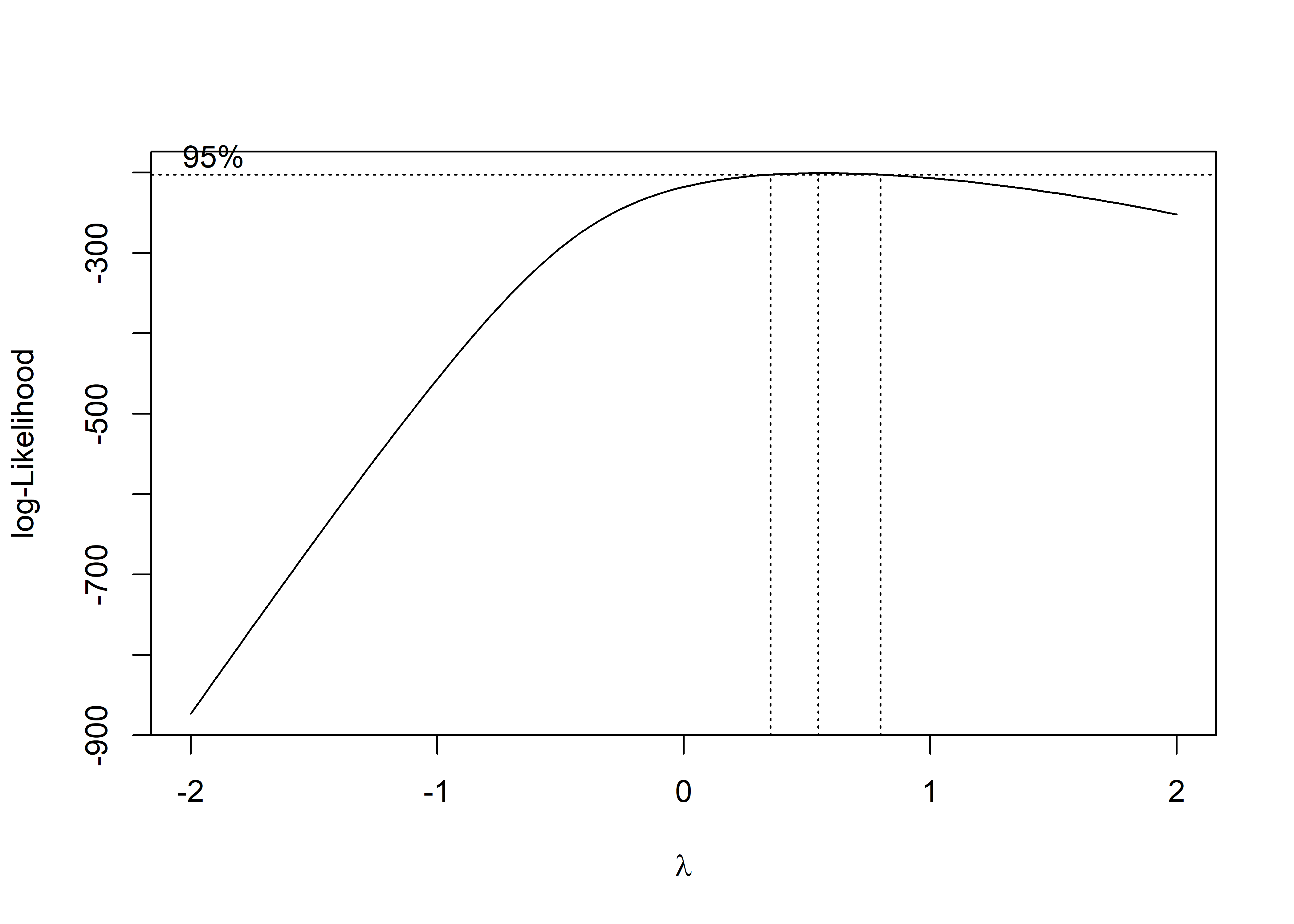
The box-cox plot shows that log-likelihood has the maximum value around lambda = 0.5, so square root of pm25_diff is the recommended transformation.
MLR
trans_diff_gdp_pop_df =
  pos_diff_gdp_pop_df %>%
  mutate(sqrt_pm25_diff = sqrt(pm25_diff))

trans_fit = lm(sqrt_pm25_diff ~gdp_trillion + pop_million, data = trans_diff_gdp_pop_df)

trans_fit %>%
  broom::tidy() %>%
knitr::kable(caption = "Linear Regression Results")| term | estimate | std.error | statistic | p.value |
|---|---|---|---|---|
| (Intercept) | 3.7187826 | 0.2799728 | 13.2826555 | 0.0000000 |
| gdp_trillion | 0.0436444 | 0.3796025 | 0.1149740 | 0.9087190 |
| pop_million | -0.0102924 | 0.0529619 | -0.1943355 | 0.8463464 |
After fitting a linear model for sqrt(mean pm2.5 AQI difference) dependent on gdp_trillion and pop_million, gdp_trillion variable has a slope of 0.0436 and pop_million variable has a slope of -0.0103 with p values of 0.909 and 0.846 which are extremely large. Therefore, GDP and population in a city don’t have significant effects on predictions of air quality improvement, in other words, we don’t have enough evidence to support that air quality improvement has a linear relationship with GDP and population.
Model Diagnostics
par(mfrow = c(2,2))
plot(trans_fit)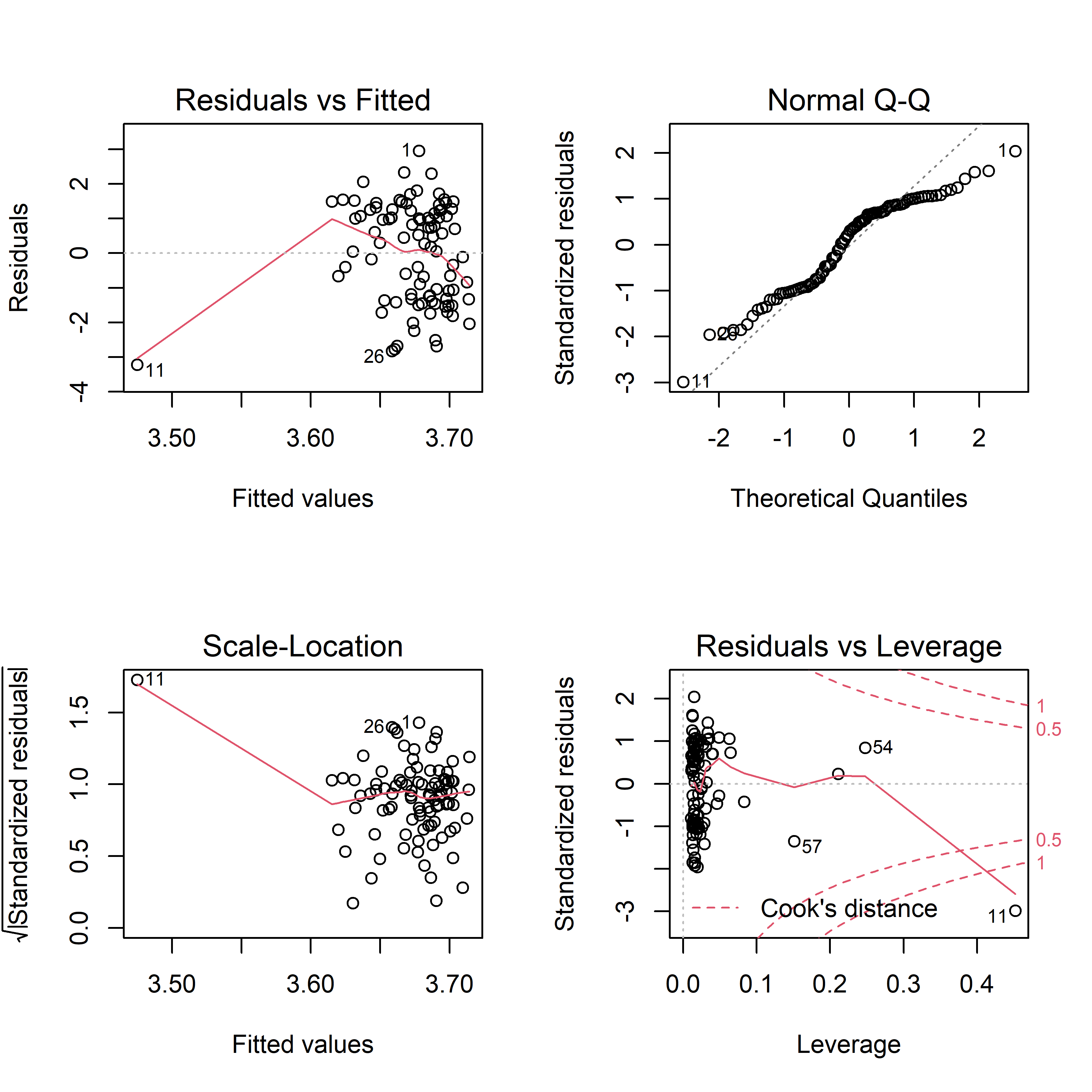 In residuals vs fitted plot, residuals appear to be evenly distributed around 0, indicating that residuals have constant variance. In normal QQ plot, a straight line is not seen, so our model violates the assumption that residuals are normally distributed. The scale-location plot shows that except for #11, residuals equally spread around a roughly horizontal line, confirming that residuals have constant variance. Finally, all the four plot show that there is an influential outlier labelled #11.
Cross Validation
Fit three models for sqrt_pm25_diff vs. gdp_trillion and pop_million.
nointer_linear_mod = lm(sqrt_pm25_diff ~ gdp_trillion + pop_million, data = trans_diff_gdp_pop_df)
inter_linear_mod = lm(sqrt_pm25_diff ~ gdp_trillion * pop_million, data = trans_diff_gdp_pop_df)
smooth_mod = gam(sqrt_pm25_diff ~ s(gdp_trillion, pop_million), data = trans_diff_gdp_pop_df)

trans_diff_gdp_pop_df %>%
  gather_predictions(nointer_linear_mod, inter_linear_mod, smooth_mod) %>%
  mutate(model = fct_inorder(model)) %>%
  ggplot(aes(x = gdp_trillion + pop_million, y = sqrt_pm25_diff)) +
  geom_point(alpha = .5) +
  geom_line(aes(y = pred), color = "red") +
  facet_grid(~model) +
  labs(
    x = "GDP in Billion + Population in Million",
    y = "Sqrt(Mean PM2.5 AQI Difference)",
    title = "Sqrt(Mean PM2.5 AQI Difference) vs GDP and Population")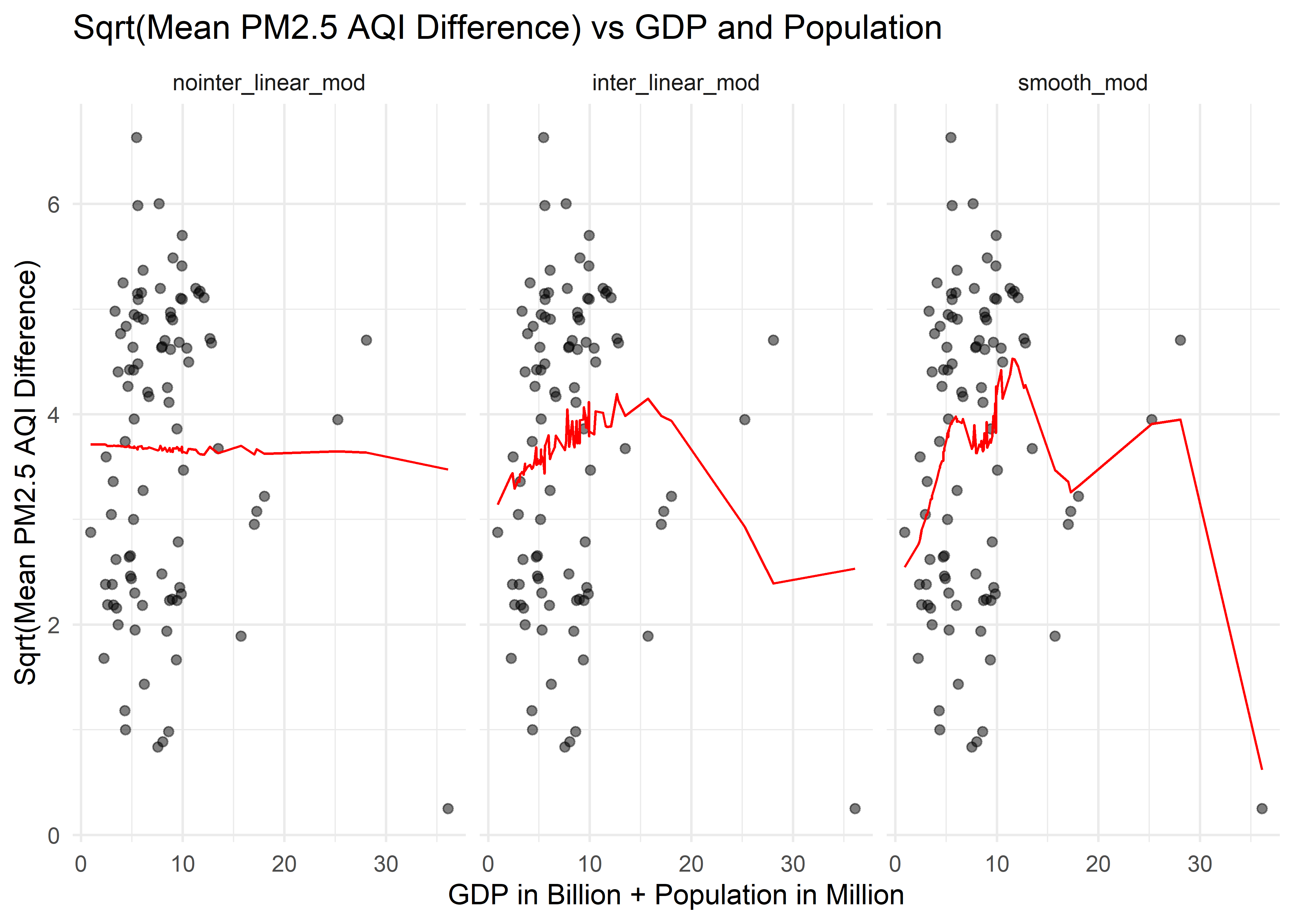
Cross validation for sqrt_pm25_diff vs. gdp_trillion and pop_million.
cv_df =
  crossv_mc(trans_diff_gdp_pop_df, 100) %>%
  mutate(
    train = map(train, as_tibble),
    test = map(test, as_tibble)) %>%
  mutate(
    nointer_linear_mod  = map(train, ~lm(sqrt_pm25_diff ~ gdp_trillion + pop_million, data = .x)),
    inter_linear_mod = map(train, ~lm(sqrt_pm25_diff ~ gdp_trillion * pop_million, data = .x)),
    smooth_mod  = map(train, ~gam(sqrt_pm25_diff ~ s(gdp_trillion, pop_million), data = .x))) %>%
  mutate(
    rmse_nointer_linear = map2_dbl(nointer_linear_mod, test, ~rmse(model = .x, data = .y)),
    rmse_inter_linear = map2_dbl(inter_linear_mod, test, ~rmse(model = .x, data = .y)),
    rmse_smooth = map2_dbl(smooth_mod, test, ~rmse(model = .x, data = .y)))


cv_df %>%
  select(starts_with("rmse")) %>%
  pivot_longer(
    everything(),
    names_to = "model",
    values_to = "rmse",
    names_prefix = "rmse_") %>%
  mutate(model = fct_inorder(model)) %>%
  ggplot(aes(x = model, y = rmse)) +
  geom_boxplot() +
  labs(
    x = "Model",
    y = "RMSE",
    title = "Distribution of RMSE across Models (Log(Mean PM2.5 AQI Difference) vs GDP +Population)") +
  theme(
    title = element_text(size = 8, face = "bold"),
    axis.title.x = element_text(size = 10),
    axis.title.y = element_text(size = 10))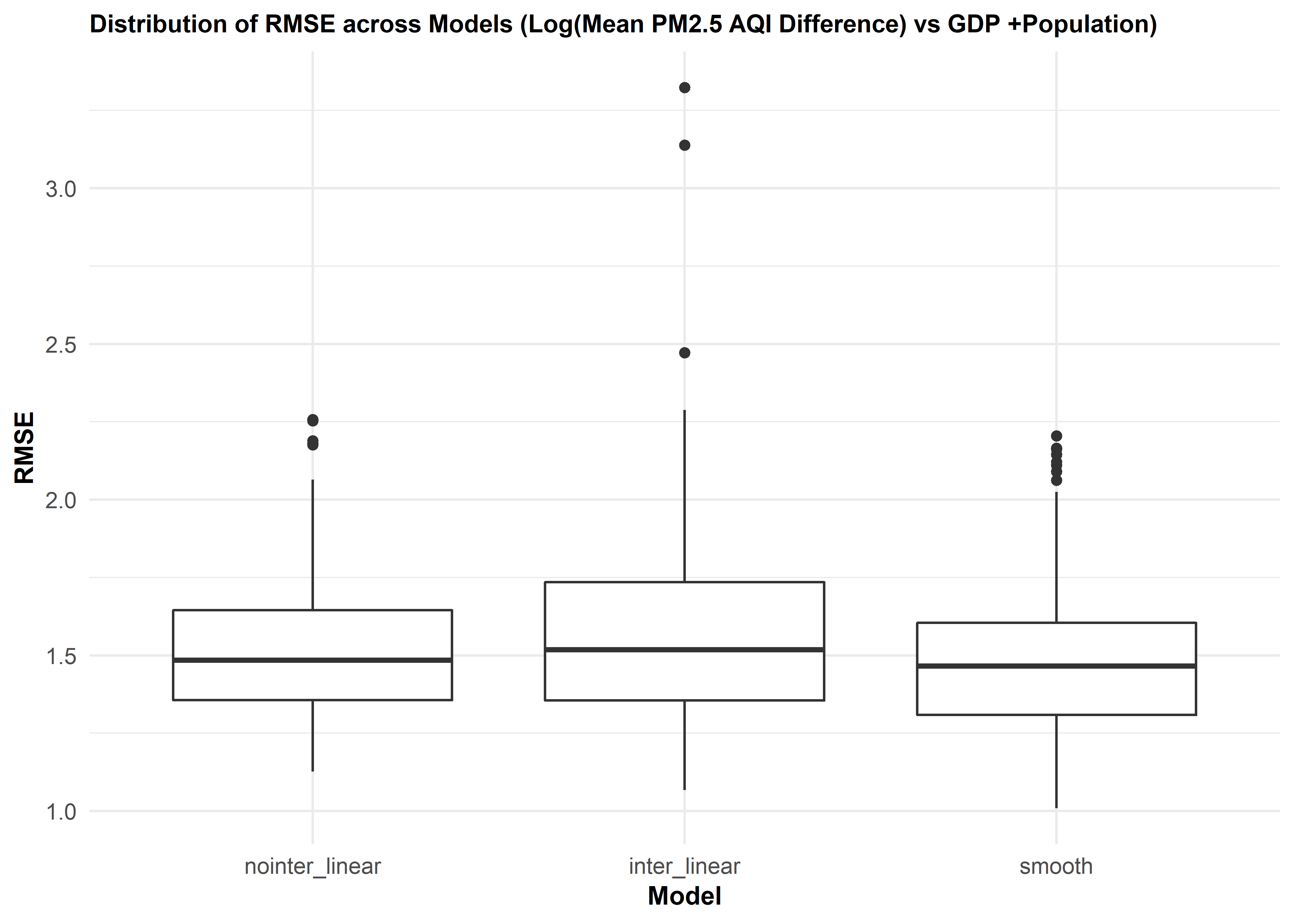
We then did cross validation for three different models of mean PM2.5 AQI difference vs. gdp_trillion and pop_million. The distribution of RMSE values for each model suggests that the smooth model works slightly better than two linear models. There is some improvement in predictive accuracy gained by allowing non-linearity, but it is not sufficient to justify this model.
Daily AQI vs Daily Average Temperature
Data frame for regression analysis
weather_df =
  rnoaa::meteo_pull_monitors(
    c("CHM00054511", "CHM00058362", "CHM00050953", "CHM00054342", "CHM00055591", "CHM00056294", "CHM00056778", "CHM00059287", "CHM00057036", "CHM00057494", "CHM00054161", "CHM00057687", "CHM00057515", "CHM00058847", "CHM00057816", "CHM00058321", "CHM00054823", "CHM00052889", "CHM00058606", "CHM00058238", "CHM00059431", "CHM00053698", "CHM00054527", "CHM00051463", "CHM00052866", "CHM00053614", "CHM00057083"),
    var = c("PRCP", "TAVG"),
    date_min = "2020-02-01",
    date_max = "2020-04-30") %>%
  mutate(
    name = recode(
      id,
      CHM00054511 = "Beijing",
      CHM00058362 = "Shanghai",
      CHM00050953 = "Harbin",
      CHM00054342 = "Shenyang",
      CHM00055591 = "Lhasa",
      CHM00056294 = "Chengdu",
      CHM00056778 = "Kunming",
      CHM00059287 = "Guangzhou",
      CHM00057036 = "Xian",
      CHM00057494 = "Wuhan",
      CHM00054161 = "Changchun",
      CHM00057687 = "Changsha",
      CHM00057515 = "Chongqing",
      CHM00058847 = "Fuzhou",
      CHM00057816 = "Guiyang",
      CHM00058321 = "Hefei",
      CHM00054823 = "Jinan",
      CHM00052889 = "Lanzhou",
      CHM00058606 = "Nanchang",
      CHM00058238 = "Nanjing",
      CHM00059431 = "Nanning",
      CHM00053698 = "Shijiazhuang",
      CHM00053772 = "Taiyuan",
      CHM00054527 = "Tianjin",
      CHM00051463 = "Wulumuqi",
      CHM00052866 = "Xining",
      CHM00053614 = "Yinchuan",
      CHM00057083 = "Zhengzhou"),
    tavg = tavg / 10,
    prcp = prcp / 10) %>%
  select(-id) %>%
  rename(city = name) %>%
  relocate(city)

city_30_df =
  city_100_df %>%
  filter(date > "2020-01-31" & date < "2020-05-01") %>%
  filter(city %in% c("Beijing", "Shanghai", "Harbin", "Shenyang", "Lhasa", "Chengdu", "Kunming", "Guangzhou", "Xian", "Wuhan", "Changchun", "Changsha", "Chongqing", "Fuzhou", "Guiyang", "Hefei", "Jinan", "Lanzhou", "Nanchang", "Nanjing", "Nanning", "Shijiazhuang", "Taiyuan", "Tianjin", "Wulumuqi", "Xining", "Yinchuan", "Zhengzhou"))

pm25_tavg_df =
  left_join(city_30_df, weather_df, by = c("city", "date")) %>%
  arrange(date) %>%
  select(city, date, pm25, tavg) %>%
  filter(pm25 != "NA")
We also hypothesize that daily PM2.5 AQI may correlate to daily average temperature. We collect 02/2020 - 04/2020 temperature data for 28 out of the 30 representative cities. Temperature data for Shenzhen and Suzhou are not founded. The resulting data frame has 2463 observations of 4 variables. Below are the variables:
city: city name
date: the date on which PM2.5 AQI and average temperature were collected
pm25: PM2.5 AQI on that day
tavg: average temperature on that day
Find appropriate transformation
fit_tavg = lm(pm25 ~tavg, data = pm25_tavg_df)
MASS::boxcox(fit_tavg)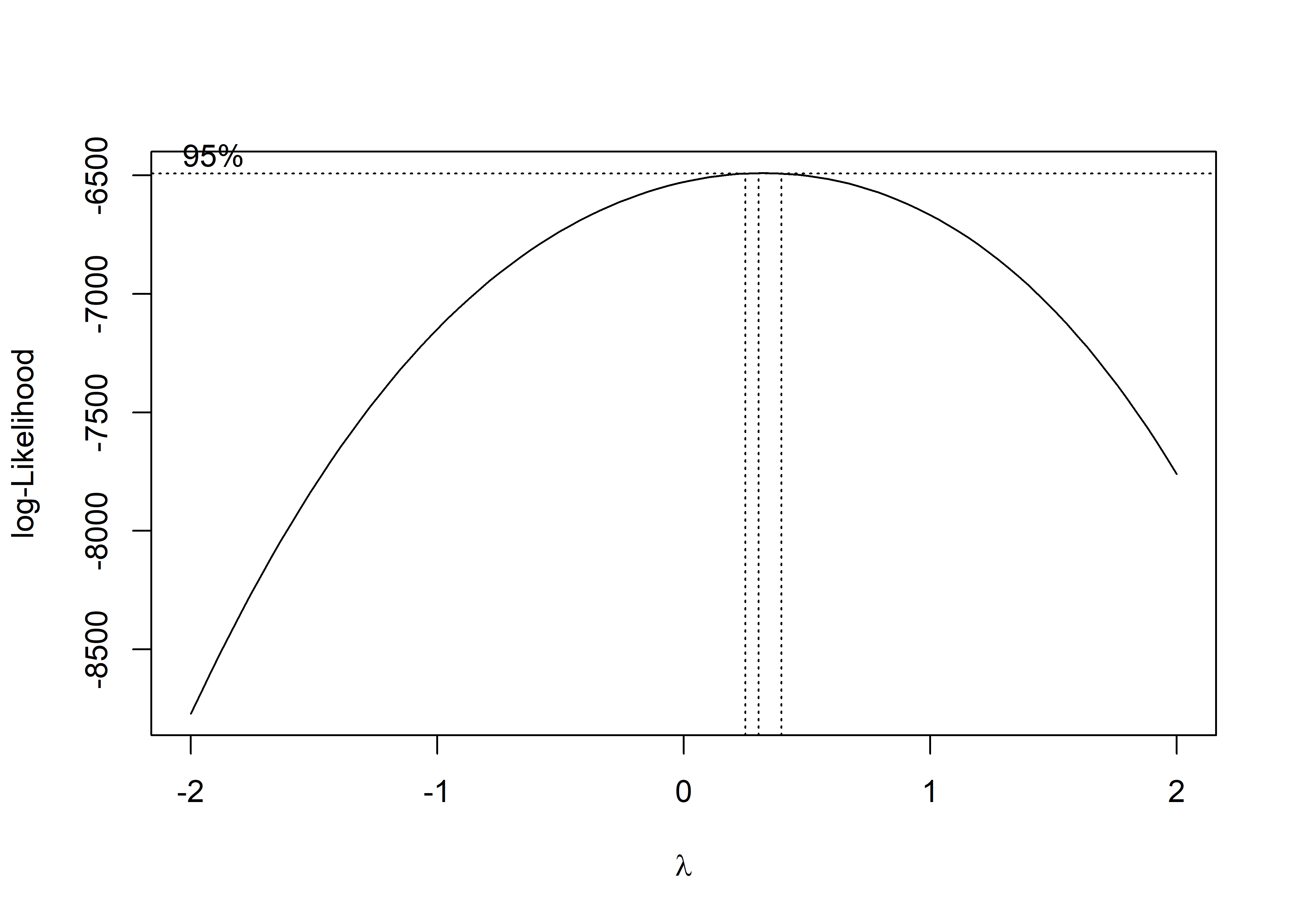
The box-cox plot shows that log-likelihood has the maximum value around lambda = 0.5, so square root of daily PM2.5 AQI is the recommended transformation.
MLR
sqrt_pm25_tavg_df =
  pm25_tavg_df %>%
  mutate(sqrtpm25 = sqrt(pm25))

sqrt_fit = lm(sqrtpm25 ~tavg, data = sqrt_pm25_tavg_df)

sqrt_fit %>%
  broom::tidy() %>%
knitr::kable(caption = "Linear Regression Results")| term | estimate | std.error | statistic | p.value |
|---|---|---|---|---|
| (Intercept) | 10.2908370 | 0.0709328 | 145.078715 | 0.000000 |
| tavg | -0.0115856 | 0.0054384 | -2.130333 | 0.033255 |
Based on this table, tavg variable has a slope of -0.012 with p value of 0.033 which is smaller than 0.05. Therefore, at 5 significance level, we can conclude that daily average temperatures in a city have significant effects on predictions of square root of daily PM2.5 AQI. The square root of daily PM2.5 AQI decreases by 0.012 as daily average temperature increases by 1 Celsius degree.
Model diagnostics
par(mfrow = c(2,2))
plot(sqrt_fit)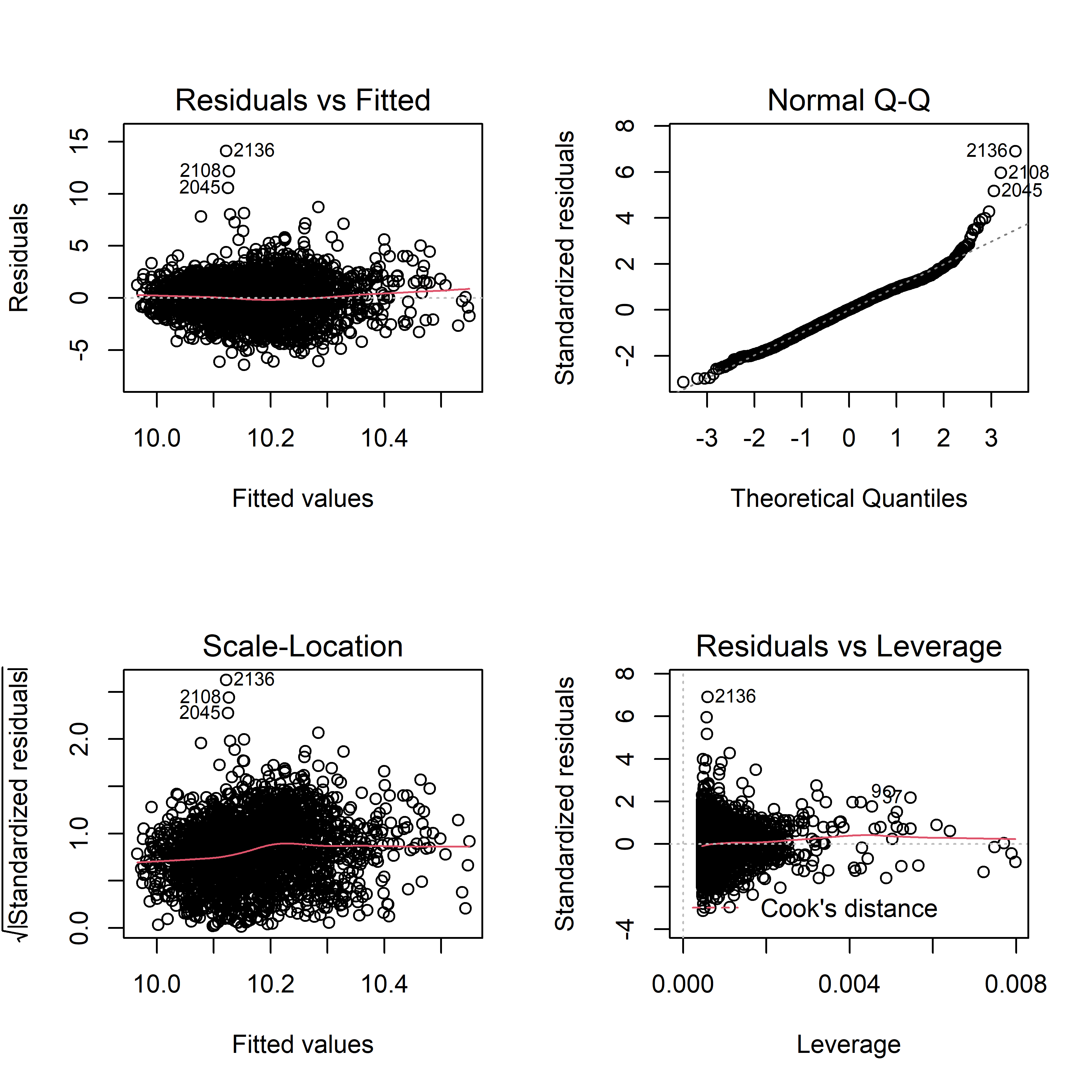
Residuals seem to be evenly distributed around 0, which is an indication of constant variance. There are some potential outliers, such as #2136 and 2108. The normal QQ plot shows a roughly straight line, meaning residuals are normally distributed. Therefore, our model fitting for daily pm2.5 AQI difference dependent on daily average temperature doesn’t violate assumptions on residuals.
Cross validation
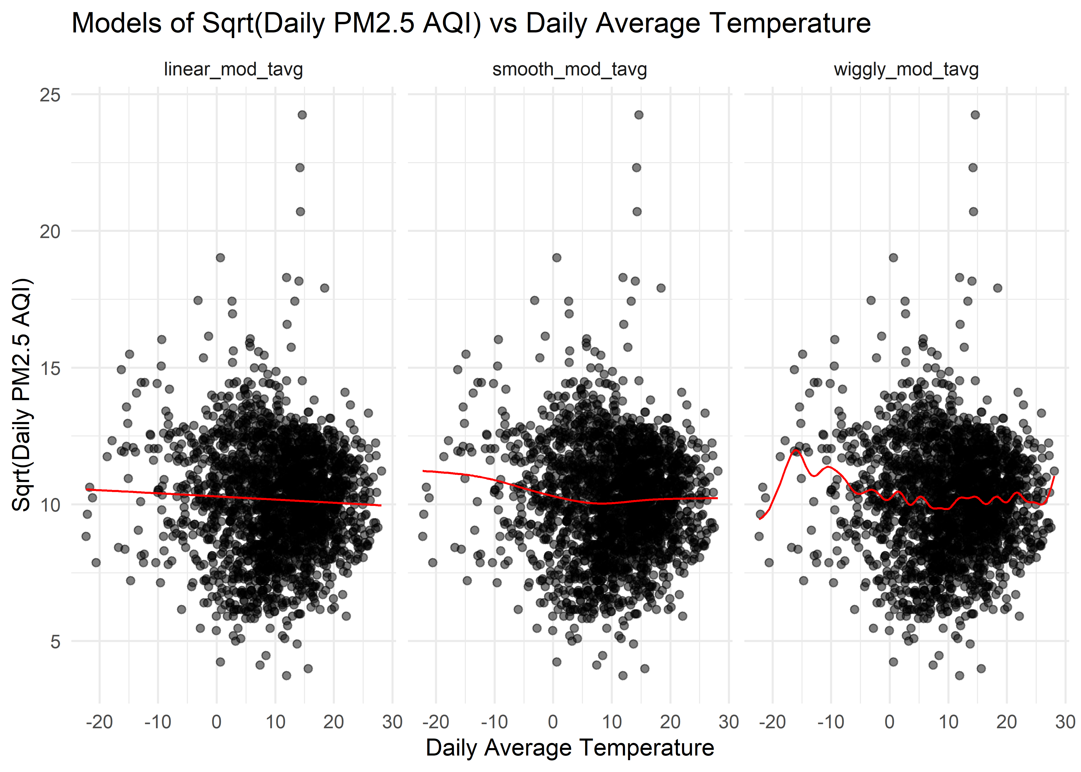
Fit three models for sqrtpm25 vs. tavg.
linear_mod_tavg = lm(sqrtpm25 ~ tavg, data = sqrt_pm25_tavg_df)
smooth_mod_tavg = gam(sqrtpm25 ~ s(tavg), data = sqrt_pm25_tavg_df)
wiggly_mod_tavg = gam(sqrtpm25 ~ s(tavg, k = 30), sp = 10e-6, data = sqrt_pm25_tavg_df)

sqrt_pm25_tavg_df %>%
  gather_predictions(linear_mod_tavg, smooth_mod_tavg, wiggly_mod_tavg) %>%
  mutate(model = fct_inorder(model)) %>%
  ggplot(aes(x = tavg, y = sqrtpm25)) +
  geom_point(alpha = .5) +
  geom_line(aes(y = pred), color = "red") +
  facet_grid(~model) +
  labs(
    x = "Daily Average Temperature",
    y = "Sqrt(Daily PM2.5 AQI)",
    title = "Models of Sqrt(Daily PM2.5 AQI) vs Daily Average Temperature"
  )
Cross validation for sqrtpm25 vs. tavg.
cv_tavg_df =
crossv_mc(sqrt_pm25_tavg_df, 100) %>%
mutate(
train = map(train, as_tibble),
test = map(test, as_tibble)) %>%
mutate(
linear_mod = map(train, ~lm(sqrtpm25 ~ tavg, data = .x)),
smooth_mod = map(train, ~mgcv::gam(sqrtpm25 ~ s(tavg), data = .x)),
wiggly_mod = map(train, ~gam(sqrtpm25 ~ s(tavg, k = 30), sp = 10e-6, data = .x))) %>%
mutate(
rmse_linear = map2_dbl(linear_mod, test, ~rmse(model = .x, data = .y)),
rmse_smooth = map2_dbl(smooth_mod, test, ~rmse(model = .x, data = .y)),
rmse_wiggly = map2_dbl(wiggly_mod, test, ~rmse(model = .x, data = .y)))
cv_tavg_df %>%
select(starts_with("rmse")) %>%
pivot_longer(
everything(),
names_to = "model",
values_to = "rmse",
names_prefix = "rmse_") %>%
mutate(model = fct_inorder(model)) %>%
ggplot(aes(x = model, y = rmse)) +
geom_boxplot() +
labs(
x = "Model",
y = "RMSE",
title = "Distribution of RMSE across Models (Sqrt(pm2.5 AQI) vs Tavg)")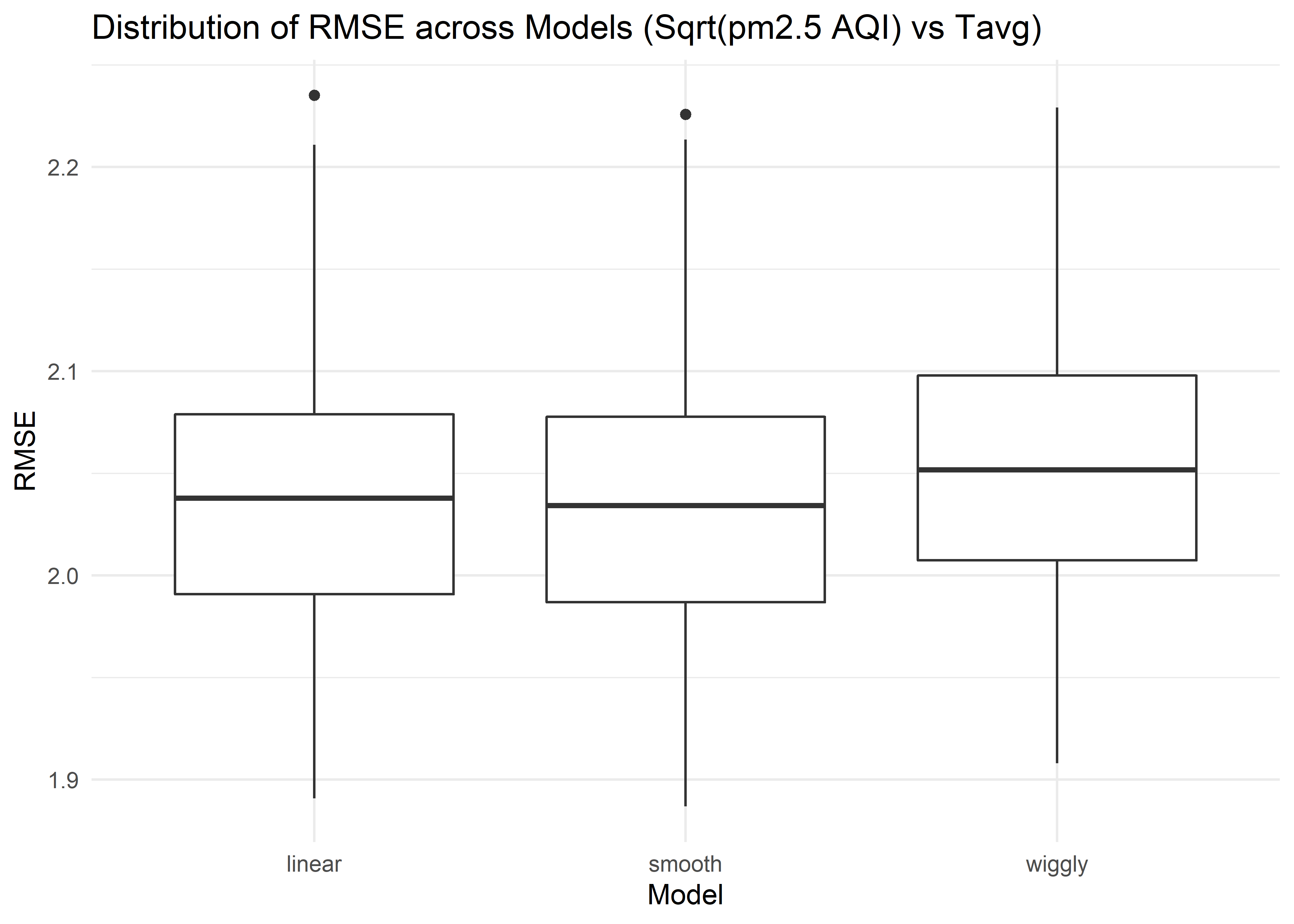 The distribution of RMSE values for each model fitting square root of daily PM2.5 AQI vs daily average temperature suggests that the linear and smooth model work slightly better than wiggly model.
Regression Conclusions
We don’t have enough evidence to support that during the lockdown period, air quality improvement in a city has a significant linear relationship with GDP and population. However, the square root of daily PM2.5 AQI is found to have a significant negative linear correlation with daily average temperature. The non-significant linear model fitting mean AQI difference vs GDP and population may be due to small sample size, so a larger sample size may be helpful for getting a significant model.
Discussion and Conclusion
Overall, we found that there was a significant relationship between the lockdown and air quality level for 30 cities combined, which was consistent with our initial hypothesis. The air quality for the 30 cities was generally better during the lockdown compared to the same period in the past year. However, contrary to what we expected before, neither GDP or population served as predictors for air quality improvement after we conducted the regression analysis. On the other hand, daily average temperature was found to be a significant predictor of daily PM2.5 AQI.
The map of China included in our analysis exhibits the distribution of magnitude of air quality improvement during the lockdown period across 100 cities. Each dot represents a city we selected, and the color indicates its degree of air quality improvement. The bluer the dot is, the more improvement it had made.
We can see that most cities with significant air quality improvement tend to cluster in the North China and Yangtze River Delta region. This might be partially explained by the economic structure. Industrial output value accounts for a relatively large proportion of GDP in these two areas. Normally, there are a lot of industrial activities going on there. However, during the lockdown period, nearly all of them were partially or completely suspended. As industry does have an unignorable negative impact on air quality, it’s not difficult to see why notable air quality improvement could be observed in these two regions.
There are a few notable limitations in our project. Firstly, besides GDP, population, and temperature, there might be variables that are more closely related to air quality improvements, for example, industrial output value. However, due to limited access to expected datasets, we failed to include it in our regression model. In addition, the 30 cities we selected are not representative since they are all relatively large in terms of scale. There are many more small cities that we hadn’t investigated. Therefore, the results we obtained in this project were not generalizable to all Chinese cities. Finally, the datasets we found contained a lot of missing values, which might undermine the reliability and validity of our study in some degree.
This project also further implicates that current economic and social development is nearly always at the expense of environmental degradation. However, there are promising ways that could tackle this problem effectively. For example, choosing means of transportation that are more environmental-friendly, using cleaner and renewable energies for production, and reducing hazardous substance emission could all ameliorate the situation to some extent.