Regression Analysis
AQI Difference vs GDP and Population
Data frame for regression analysis
library(tidyverse)
library(ggridges)
library(modelr)
library(mgcv)
library(patchwork)

theme_set(theme_minimal() + theme(legend.position = "bottom"))

options(
  ggplot2.continuous.colour = "viridis",
  ggplot2.continuous.fill = "viridis"
)

scale_colour_discrete = scale_colour_viridis_d
scale_fill_discrete = scale_fill_viridis_d

city_100_df =
  tibble(
  file = list.files("100_cities_data")) %>%
  mutate(
    city = str_remove(file, "-air-quality.csv"),
    path = str_c("100_cities_data/", file),
    data = map(path, read_csv)
  ) %>%
  unnest(data) %>%
  select(-file, -path) %>%
  mutate(
    city = str_to_title(city),
    date = as.Date(date, format = "%Y/%m/%d"))

pm25_2020 =
  city_100_df %>%
  filter(date > "2020-01-31" & date < "2020-05-01") %>%
  group_by(city) %>%
  summarize(mean_pm25_2020 = mean(pm25, na.rm = T))

pm25_2019 =
  city_100_df %>%
  filter(date > "2019-01-31" & date < "2019-05-01") %>%
  group_by(city) %>%
  summarize(mean_pm25_2019 = mean(pm25, na.rm = T))

pm25_diff =
  left_join(pm25_2020, pm25_2019) %>%
  mutate(pm25_diff = mean_pm25_2019 - mean_pm25_2020)

gdp_pop_df =
  read_csv("data/gpd_and_popluation.csv") %>%
  janitor::clean_names() %>%
  mutate(
    gdp_trillion = gdp_billion / 1000,
    pop_million = population_thousand / 1000) %>%
  select(city, gdp_trillion, pop_million)

diff_gdp_pop_df =
  left_join(pm25_diff, gdp_pop_df) %>%
  select(-mean_pm25_2020, -mean_pm25_2019)
We learn that air quality improvement in a city may correlate to the city’s GDP and population, so we create a data frame containing mean pm2.5 AQI differences between 2019 and 2020, GDP and population in 2019 for 100 representative cities.
The resulting data frame of diff_gdp_pop_df contains 100 observations of 4 variables. Each row represents one unique city. Below are key variables:
city: city name
pm25_diff: difference of mean pm2.5 AQI during the lockdown period (Feb-Apr) between 2019 and 2020
gdp_trillion: 2019 GDP in trillion
pop_million: 2019 population in thousand
Find Appropriate Transformation
Since the boxcox function only works with positive values for the response variable y, we removed pm25_diff less than 0 to check if a transformation is appropriate here.
pos_diff_gdp_pop_df =
  diff_gdp_pop_df %>%
  filter(pm25_diff > 0)

fit = lm(pm25_diff ~gdp_trillion + pop_million, data = pos_diff_gdp_pop_df)
MASS::boxcox(fit)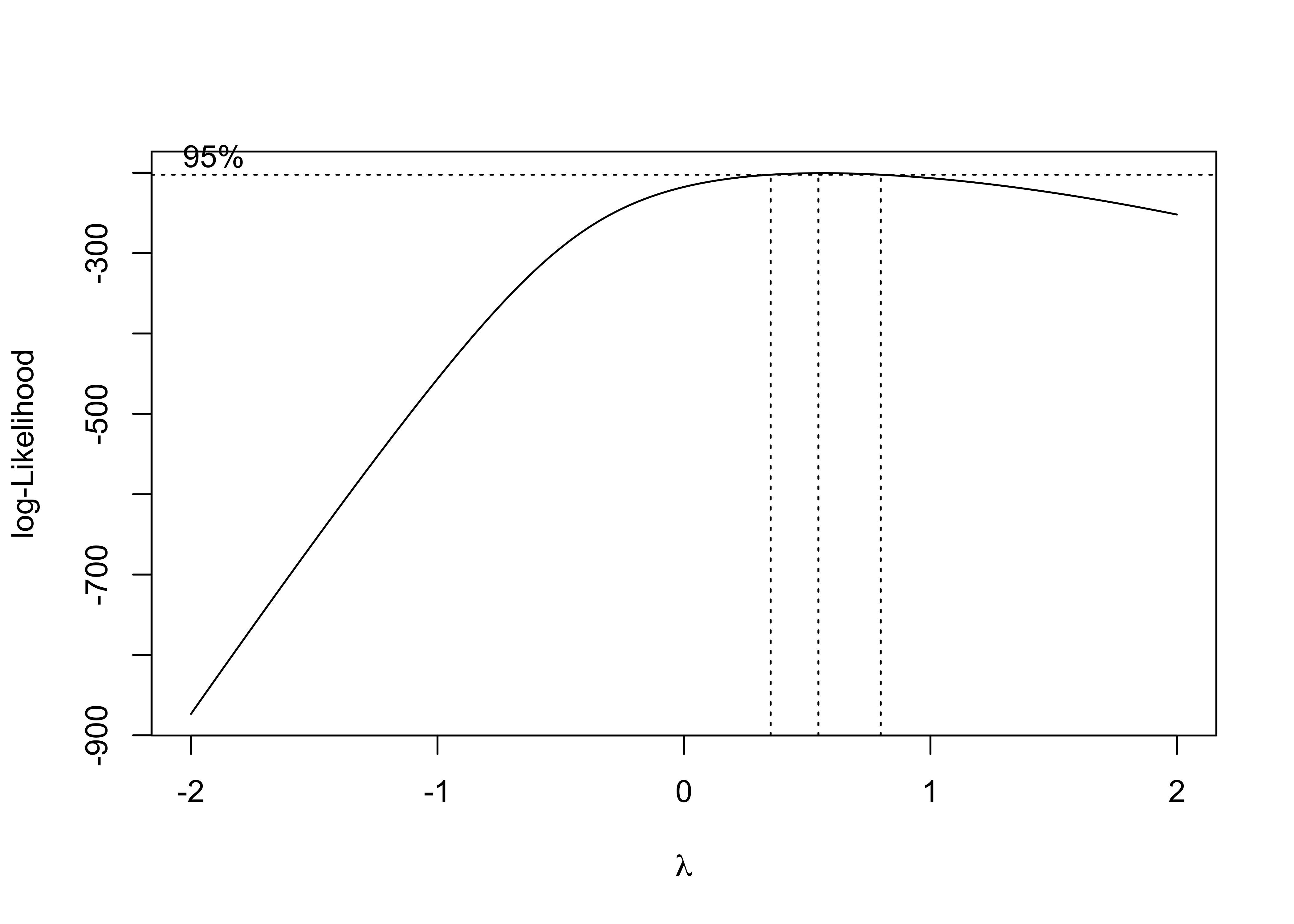
The box-cox plot shows that log-likelihood has the maximum value around lambda = 0.5, so square root of pm25_diff is the recommended transformation.
MLR
trans_diff_gdp_pop_df =
  pos_diff_gdp_pop_df %>%
  mutate(sqrt_pm25_diff = sqrt(pm25_diff))

trans_fit = lm(sqrt_pm25_diff ~gdp_trillion + pop_million, data = trans_diff_gdp_pop_df)

trans_fit %>%
  broom::tidy() %>%
knitr::kable(caption = "Linear Regression Results")| term | estimate | std.error | statistic | p.value |
|---|---|---|---|---|
| (Intercept) | 3.7187826 | 0.2799728 | 13.2826555 | 0.0000000 |
| gdp_trillion | 0.0436444 | 0.3796025 | 0.1149740 | 0.9087190 |
| pop_million | -0.0102924 | 0.0529619 | -0.1943355 | 0.8463464 |
After fitting a linear model for sqrt(mean pm2.5 AQI difference) dependent on gdp_trillion and pop_million, gdp_trillion variable has a slope of 0.0436 and pop_million variable has a slope of -0.0103 with p values of 0.909 and 0.846 which are extremely large. Therefore, GDP and population in a city don’t have significant effects on predictions of air quality improvement, in other words, we don’t have enough evidence to support that air quality improvement has a linear relationship with GDP and population.
Model Diagnostics
par(mfrow = c(2,2))
plot(trans_fit)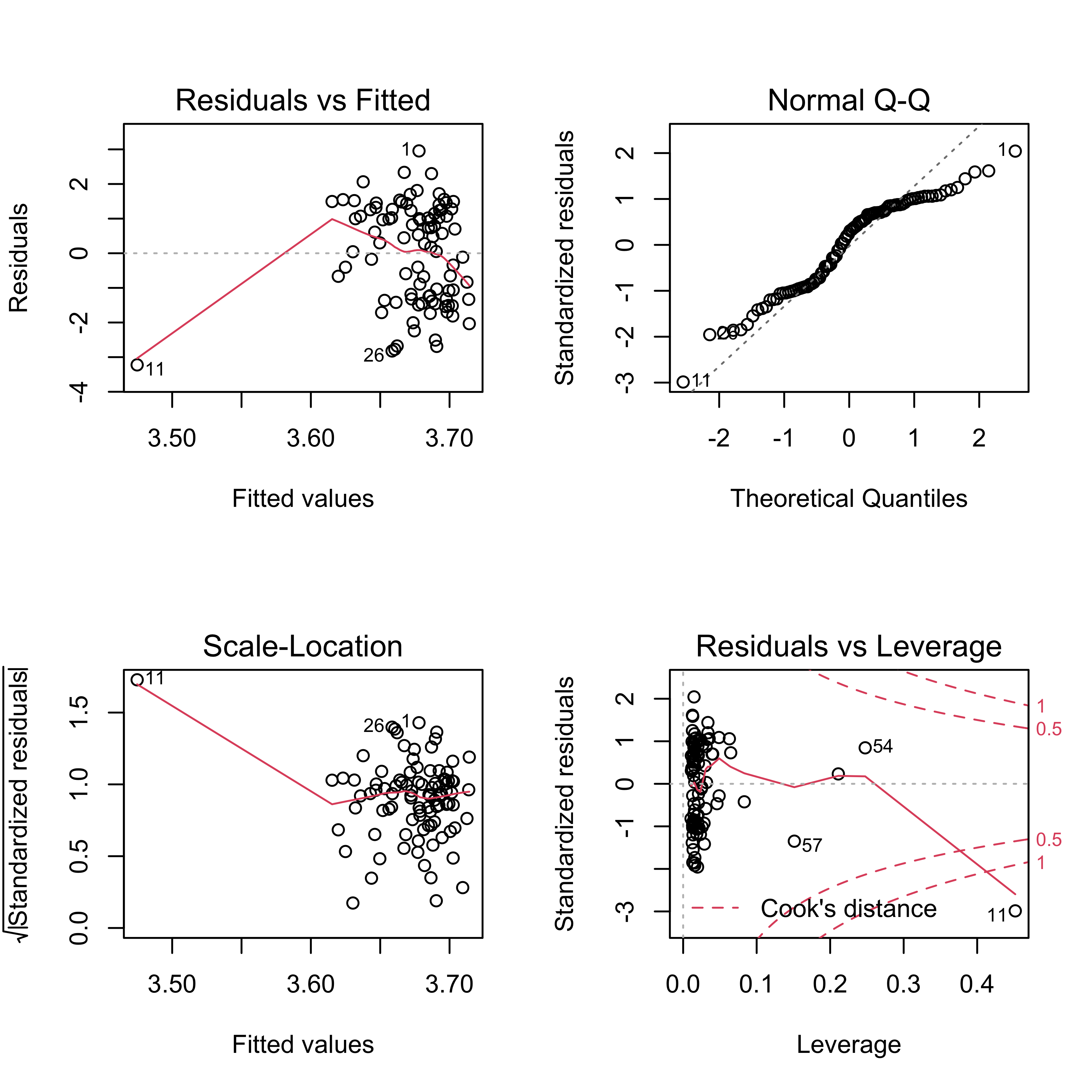 In residuals vs fitted plot, residuals appear to be evenly distributed around 0, indicating that residuals have constant variance. In normal QQ plot, a straight line is not seen, so our model violates the assumption that residuals are normally distributed. The scale-location plot shows that except for #11, residuals equally spread around a roughly horizontal line, confirming that residuals have constant variance. Finally, all the four plot show that there is an influential outlier labelled #11.
Cross Validation
Fit three models for sqrt_pm25_diff vs. gdp_trillion and pop_million.
nointer_linear_mod = lm(sqrt_pm25_diff ~ gdp_trillion + pop_million, data = trans_diff_gdp_pop_df)
inter_linear_mod = lm(sqrt_pm25_diff ~ gdp_trillion * pop_million, data = trans_diff_gdp_pop_df)
smooth_mod = gam(sqrt_pm25_diff ~ s(gdp_trillion, pop_million), data = trans_diff_gdp_pop_df)

trans_diff_gdp_pop_df %>%
  gather_predictions(nointer_linear_mod, inter_linear_mod, smooth_mod) %>%
  mutate(model = fct_inorder(model)) %>%
  ggplot(aes(x = gdp_trillion + pop_million, y = sqrt_pm25_diff)) +
  geom_point(alpha = .5) +
  geom_line(aes(y = pred), color = "red") +
  facet_grid(~model) +
  labs(
    x = "GDP in Billion + Population in Million",
    y = "Sqrt(Mean PM2.5 AQI Difference)",
    title = "Sqrt(Mean PM2.5 AQI Difference) vs GDP and Population")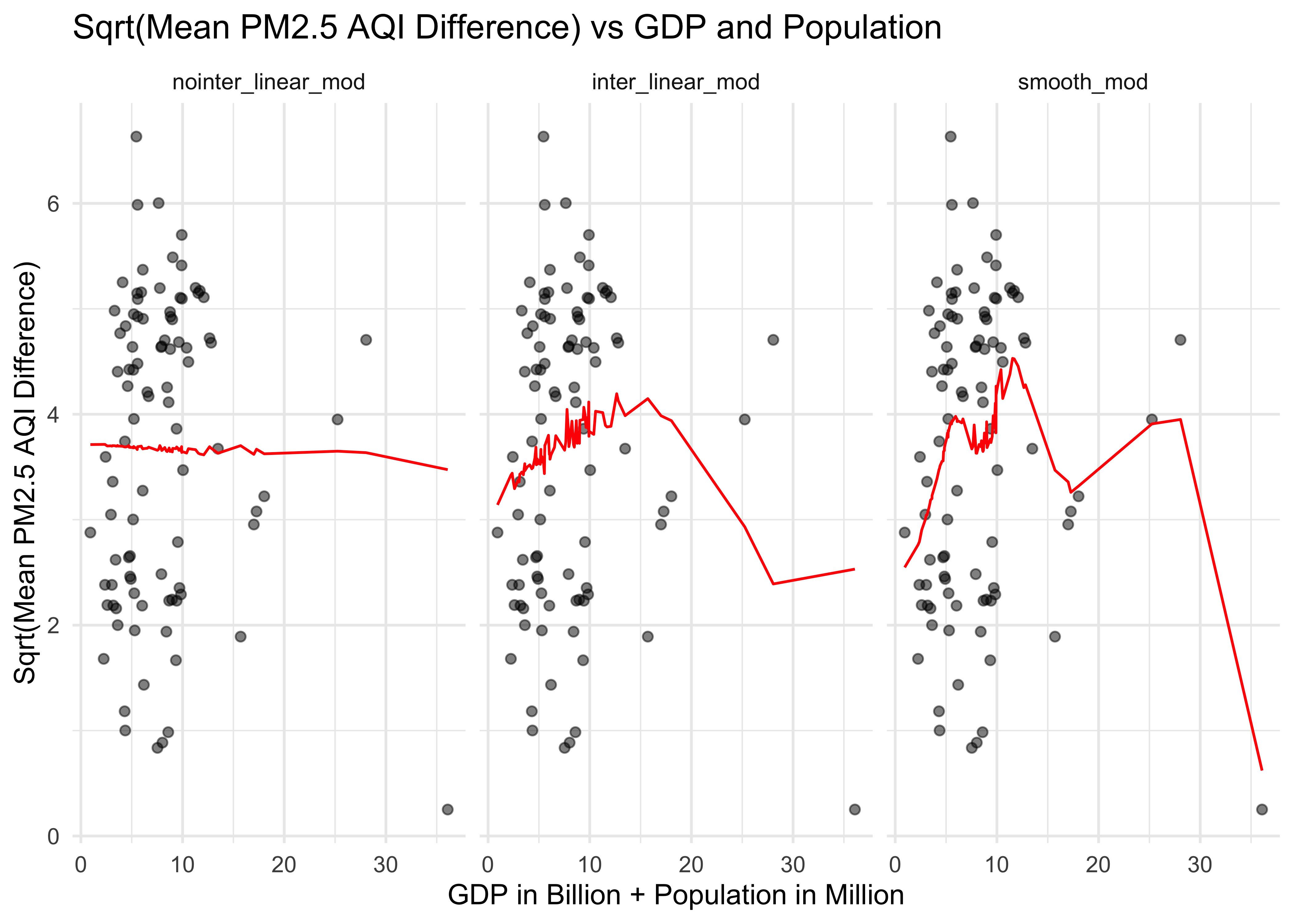
Cross validation for sqrt_pm25_diff vs. gdp_trillion and pop_million.
cv_df =
  crossv_mc(trans_diff_gdp_pop_df, 100) %>%
  mutate(
    train = map(train, as_tibble),
    test = map(test, as_tibble)) %>%
  mutate(
    nointer_linear_mod  = map(train, ~lm(sqrt_pm25_diff ~ gdp_trillion + pop_million, data = .x)),
    inter_linear_mod = map(train, ~lm(sqrt_pm25_diff ~ gdp_trillion * pop_million, data = .x)),
    smooth_mod  = map(train, ~gam(sqrt_pm25_diff ~ s(gdp_trillion, pop_million), data = .x))) %>%
  mutate(
    rmse_nointer_linear = map2_dbl(nointer_linear_mod, test, ~rmse(model = .x, data = .y)),
    rmse_inter_linear = map2_dbl(inter_linear_mod, test, ~rmse(model = .x, data = .y)),
    rmse_smooth = map2_dbl(smooth_mod, test, ~rmse(model = .x, data = .y)))


cv_df %>%
  select(starts_with("rmse")) %>%
  pivot_longer(
    everything(),
    names_to = "model",
    values_to = "rmse",
    names_prefix = "rmse_") %>%
  mutate(model = fct_inorder(model)) %>%
  ggplot(aes(x = model, y = rmse)) +
  geom_boxplot() +
  labs(
    x = "Model",
    y = "RMSE",
    title = "Distribution of RMSE across Models (Log(Mean PM2.5 AQI Difference) vs GDP +Population)") +
  theme(
    title = element_text(size = 8, face = "bold"),
    axis.title.x = element_text(size = 10),
    axis.title.y = element_text(size = 10))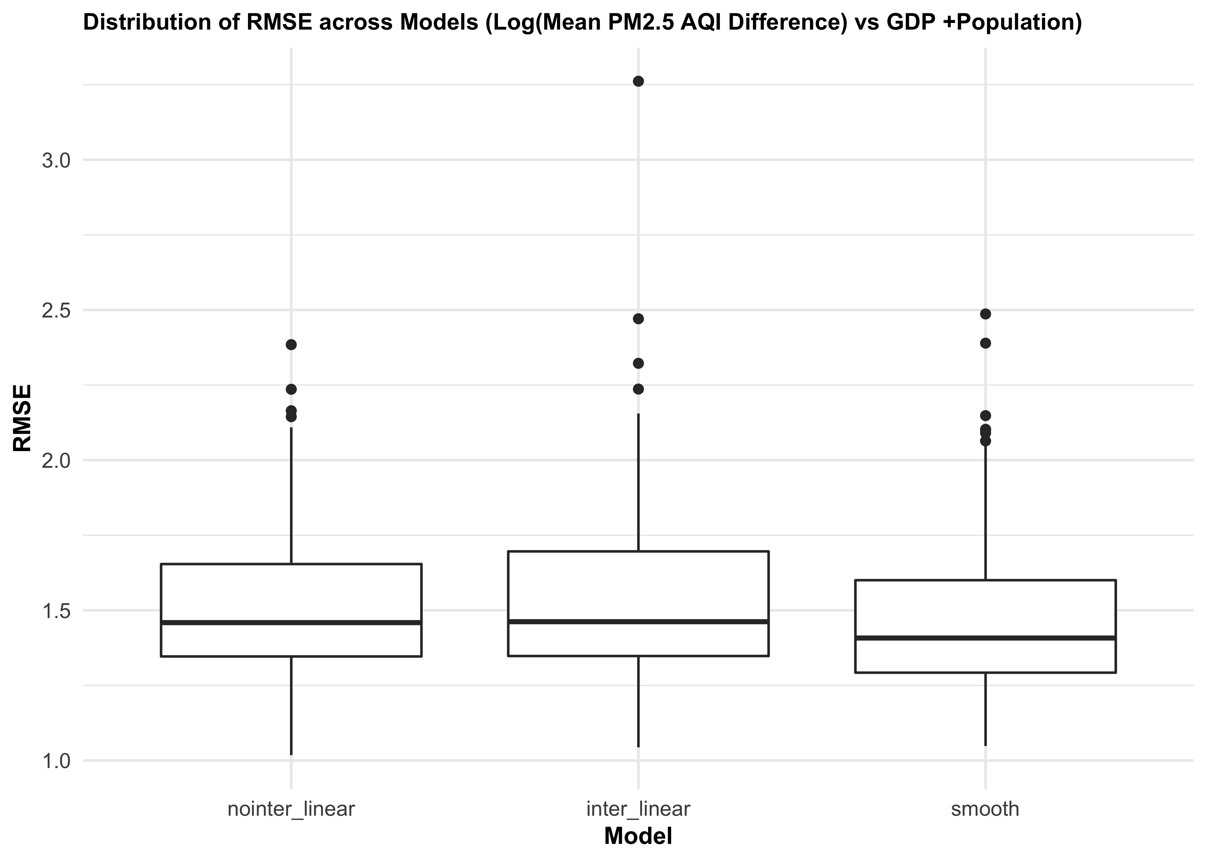
We then did cross validation for three different models of mean PM2.5 AQI difference vs. gdp_trillion and pop_million. The distribution of RMSE values for each model suggests that the smooth model works slightly better than two linear models. There is some improvement in predictive accuracy gained by allowing non-linearity, but it is not sufficient to justify this model.
Daily AQI vs Daily Average Temperature
Data frame for regression analysis
weather_df =
  rnoaa::meteo_pull_monitors(
    c("CHM00054511", "CHM00058362", "CHM00050953", "CHM00054342", "CHM00055591", "CHM00056294", "CHM00056778", "CHM00059287", "CHM00057036", "CHM00057494", "CHM00054161", "CHM00057687", "CHM00057515", "CHM00058847", "CHM00057816", "CHM00058321", "CHM00054823", "CHM00052889", "CHM00058606", "CHM00058238", "CHM00059431", "CHM00053698", "CHM00054527", "CHM00051463", "CHM00052866", "CHM00053614", "CHM00057083"),
    var = c("PRCP", "TAVG"),
    date_min = "2020-02-01",
    date_max = "2020-04-30") %>%
  mutate(
    name = recode(
      id,
      CHM00054511 = "Beijing",
      CHM00058362 = "Shanghai",
      CHM00050953 = "Harbin",
      CHM00054342 = "Shenyang",
      CHM00055591 = "Lhasa",
      CHM00056294 = "Chengdu",
      CHM00056778 = "Kunming",
      CHM00059287 = "Guangzhou",
      CHM00057036 = "Xian",
      CHM00057494 = "Wuhan",
      CHM00054161 = "Changchun",
      CHM00057687 = "Changsha",
      CHM00057515 = "Chongqing",
      CHM00058847 = "Fuzhou",
      CHM00057816 = "Guiyang",
      CHM00058321 = "Hefei",
      CHM00054823 = "Jinan",
      CHM00052889 = "Lanzhou",
      CHM00058606 = "Nanchang",
      CHM00058238 = "Nanjing",
      CHM00059431 = "Nanning",
      CHM00053698 = "Shijiazhuang",
      CHM00053772 = "Taiyuan",
      CHM00054527 = "Tianjin",
      CHM00051463 = "Wulumuqi",
      CHM00052866 = "Xining",
      CHM00053614 = "Yinchuan",
      CHM00057083 = "Zhengzhou"),
    tavg = tavg / 10,
    prcp = prcp / 10) %>%
  select(-id) %>%
  rename(city = name) %>%
  relocate(city)

city_30_df =
  city_100_df %>%
  filter(date > "2020-01-31" & date < "2020-05-01") %>%
  filter(city %in% c("Beijing", "Shanghai", "Harbin", "Shenyang", "Lhasa", "Chengdu", "Kunming", "Guangzhou", "Xian", "Wuhan", "Changchun", "Changsha", "Chongqing", "Fuzhou", "Guiyang", "Hefei", "Jinan", "Lanzhou", "Nanchang", "Nanjing", "Nanning", "Shijiazhuang", "Taiyuan", "Tianjin", "Wulumuqi", "Xining", "Yinchuan", "Zhengzhou"))

pm25_tavg_df =
  left_join(city_30_df, weather_df, by = c("city", "date")) %>%
  arrange(date) %>%
  select(city, date, pm25, tavg) %>%
  filter(pm25 != "NA")
We also hypothesize that daily PM2.5 AQI may correlate to daily average temperature. We collect 02/2020 - 04/2020 temperature data for 28 out of the 30 representative cities. Temperature data for Shenzhen and Suzhou are not founded. The resulting data frame has 2463 observations of 4 variables. Below are the variables:
city: city name
date: the date on which PM2.5 AQI and average temperature were collected
pm25: PM2.5 AQI on that day
tavg: average temperature on that day
Find appropriate transformation
fit_tavg = lm(pm25 ~tavg, data = pm25_tavg_df)
MASS::boxcox(fit_tavg)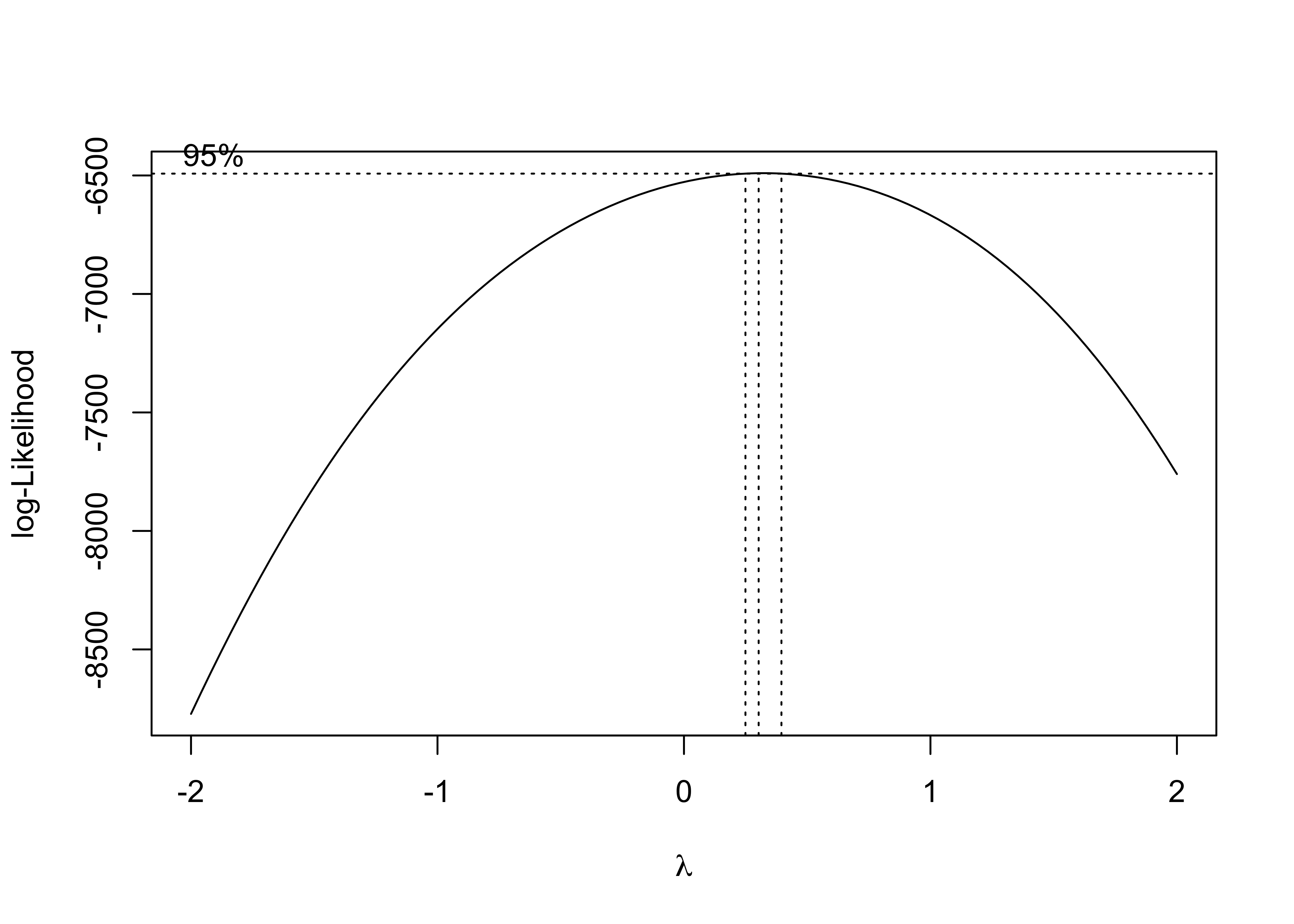
The box-cox plot shows that log-likelihood has the maximum value around lambda = 0.5, so square root of daily PM2.5 AQI is the recommended transformation.
MLR
sqrt_pm25_tavg_df =
  pm25_tavg_df %>%
  mutate(sqrtpm25 = sqrt(pm25))

sqrt_fit = lm(sqrtpm25 ~tavg, data = sqrt_pm25_tavg_df)

sqrt_fit %>%
  broom::tidy() %>%
knitr::kable(caption = "Linear Regression Results")| term | estimate | std.error | statistic | p.value |
|---|---|---|---|---|
| (Intercept) | 10.2908370 | 0.0709328 | 145.078715 | 0.000000 |
| tavg | -0.0115856 | 0.0054384 | -2.130333 | 0.033255 |
Based on this table, tavg variable has a slope of -0.012 with p value of 0.033 which is smaller than 0.05. Therefore, at 5 significance level, we can conclude that daily average temperatures in a city have significant effects on predictions of square root of daily PM2.5 AQI. The square root of daily PM2.5 AQI decreases by 0.012 as daily average temperature increases by 1 Celsius degree.
Model diagnostics
par(mfrow = c(2,2))
plot(sqrt_fit)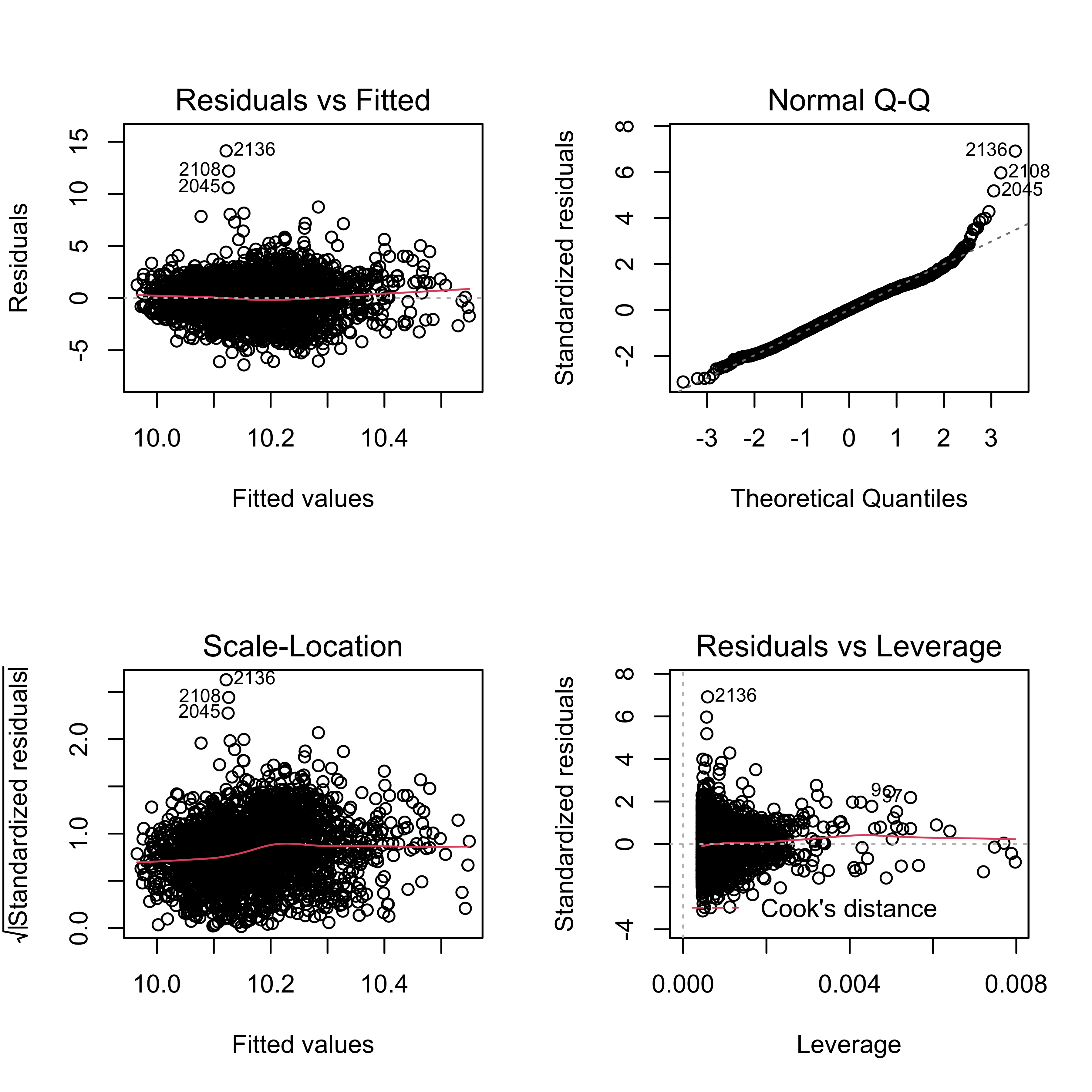
Residuals seem to be evenly distributed around 0, which is an indication of constant variance. There are some potential outliers, such as #2136 and 2108. The normal QQ plot shows a roughly straight line, meaning residuals are normally distributed. Therefore, our model fitting for daily pm2.5 AQI difference dependent on daily average temperature doesn’t violate assumptions on residuals.
Cross validation
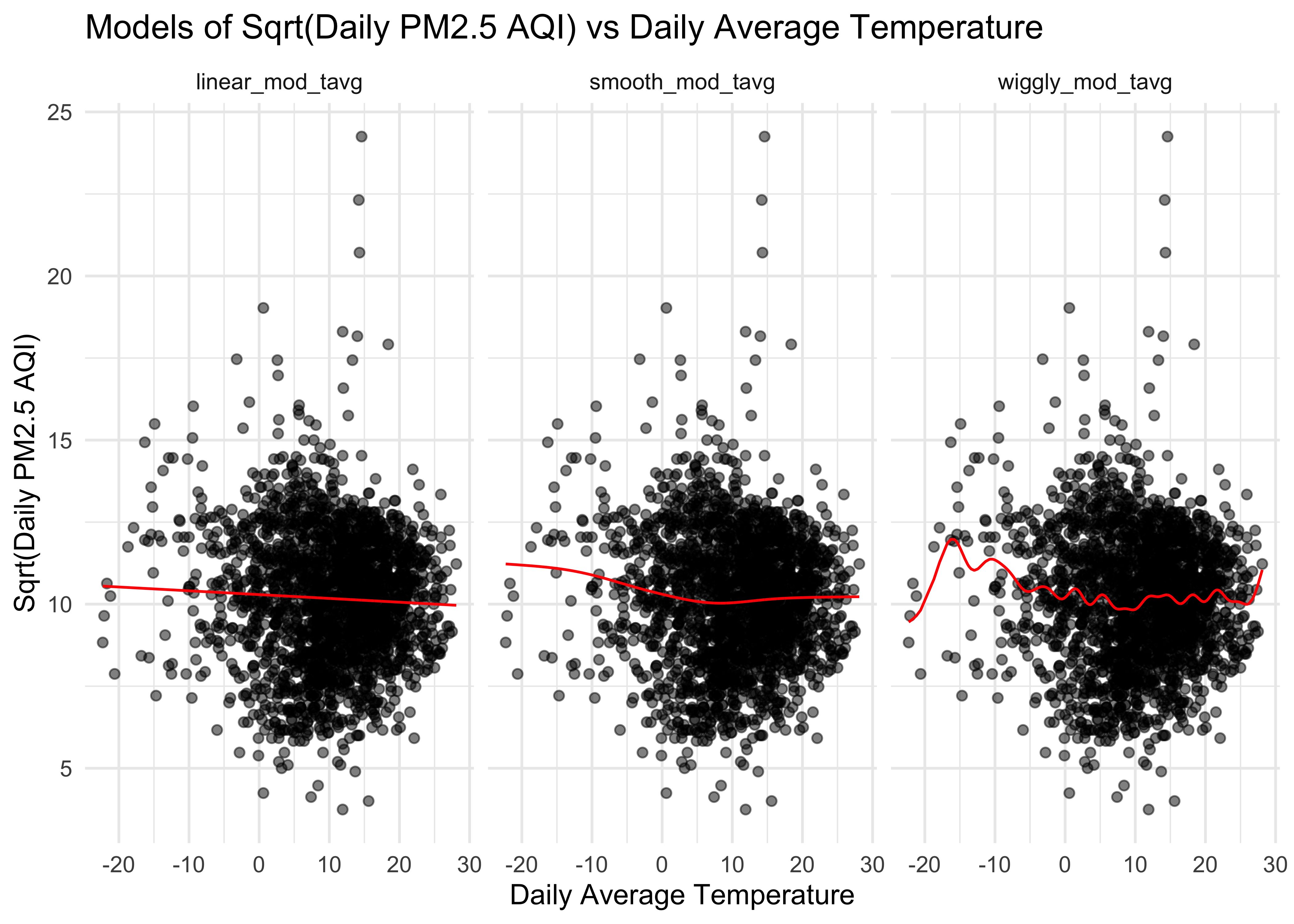
Fit three models for sqrtpm25 vs. tavg.
linear_mod_tavg = lm(sqrtpm25 ~ tavg, data = sqrt_pm25_tavg_df)
smooth_mod_tavg = gam(sqrtpm25 ~ s(tavg), data = sqrt_pm25_tavg_df)
wiggly_mod_tavg = gam(sqrtpm25 ~ s(tavg, k = 30), sp = 10e-6, data = sqrt_pm25_tavg_df)

sqrt_pm25_tavg_df %>%
  gather_predictions(linear_mod_tavg, smooth_mod_tavg, wiggly_mod_tavg) %>%
  mutate(model = fct_inorder(model)) %>%
  ggplot(aes(x = tavg, y = sqrtpm25)) +
  geom_point(alpha = .5) +
  geom_line(aes(y = pred), color = "red") +
  facet_grid(~model) +
  labs(
    x = "Daily Average Temperature",
    y = "Sqrt(Daily PM2.5 AQI)",
    title = "Models of Sqrt(Daily PM2.5 AQI) vs Daily Average Temperature"
  )
Cross validation for sqrtpm25 vs. tavg.
cv_tavg_df =
  crossv_mc(sqrt_pm25_tavg_df, 100) %>%
  mutate(
    train = map(train, as_tibble),
    test = map(test, as_tibble)) %>%
  mutate(
    linear_mod  = map(train, ~lm(sqrtpm25 ~ tavg, data = .x)),
    smooth_mod  = map(train, ~mgcv::gam(sqrtpm25 ~ s(tavg), data = .x)),
    wiggly_mod  = map(train, ~gam(sqrtpm25 ~ s(tavg, k = 30), sp = 10e-6, data = .x))) %>%
  mutate(
    rmse_linear = map2_dbl(linear_mod, test, ~rmse(model = .x, data = .y)),
    rmse_smooth = map2_dbl(smooth_mod, test, ~rmse(model = .x, data = .y)),
    rmse_wiggly = map2_dbl(wiggly_mod, test, ~rmse(model = .x, data = .y)))

cv_tavg_df %>%
  select(starts_with("rmse")) %>%
  pivot_longer(
    everything(),
    names_to = "model",
    values_to = "rmse",
    names_prefix = "rmse_") %>%
  mutate(model = fct_inorder(model)) %>%
  ggplot(aes(x = model, y = rmse)) +
  geom_boxplot() +
  labs(
    x = "Model",
    y = "RMSE",
    title = "Distribution of RMSE across Models (Sqrt(pm2.5 AQI) vs Tavg)")
The distribution of RMSE values for each model fitting square root of daily PM2.5 AQI vs daily average temperature suggests that the linear and smooth model work slightly better than wiggly model.
Regression Conclusions
We don’t have enough evidence to support that during the lockdown period, air quality improvement in a city has a significant linear relationship with GDP and population. However, the square root of daily PM2.5 AQI is found to have a significant negative linear correlation with daily average temperature. The non-significant linear model fitting mean AQI difference vs GDP and population may be due to small sample size, so a larger sample size may be helpful for getting a significant model.